Dibimbing.id Website UI/UX Redesign
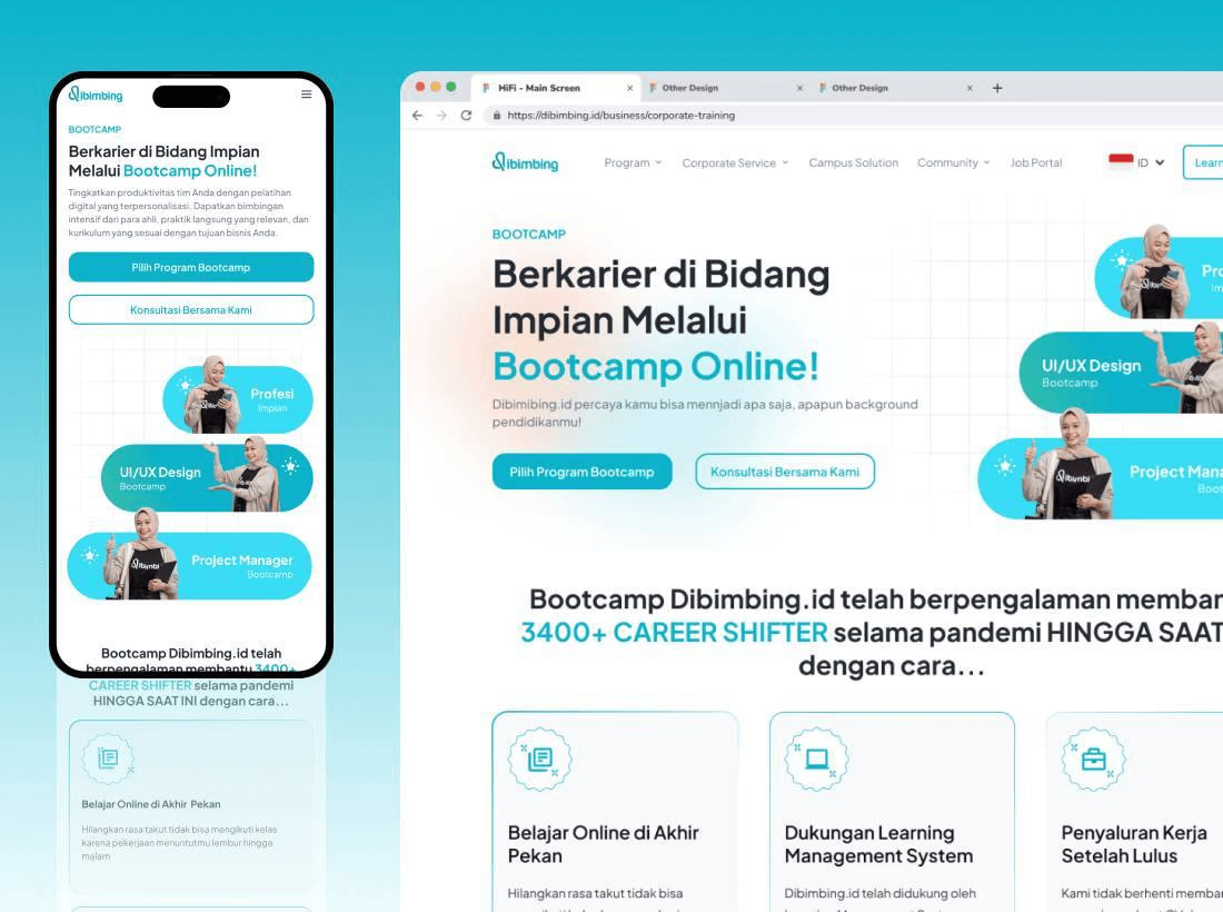
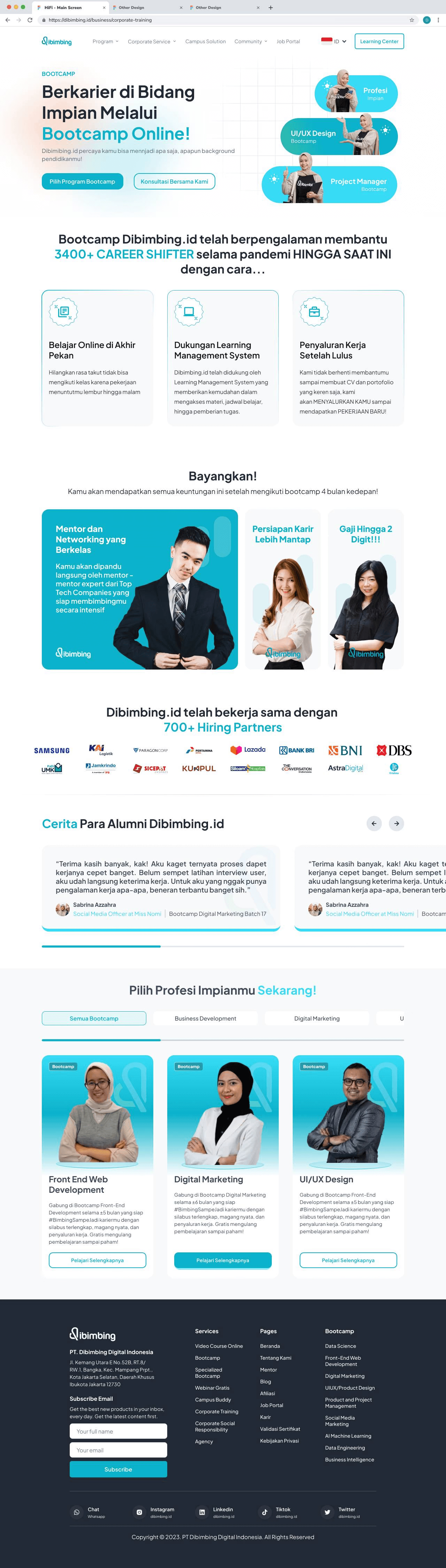
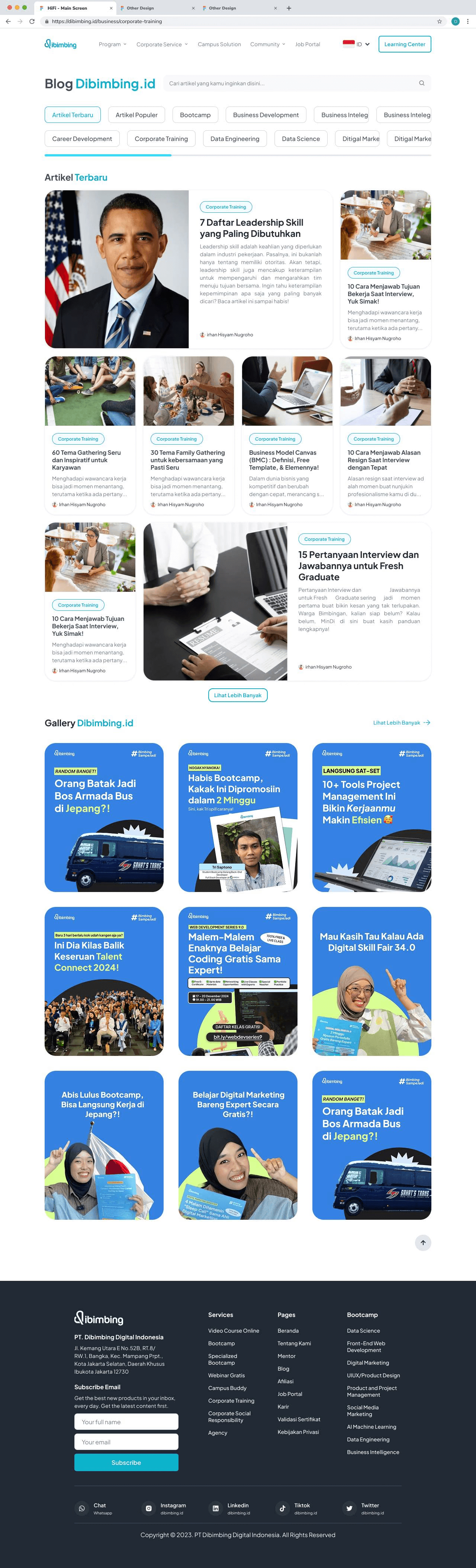
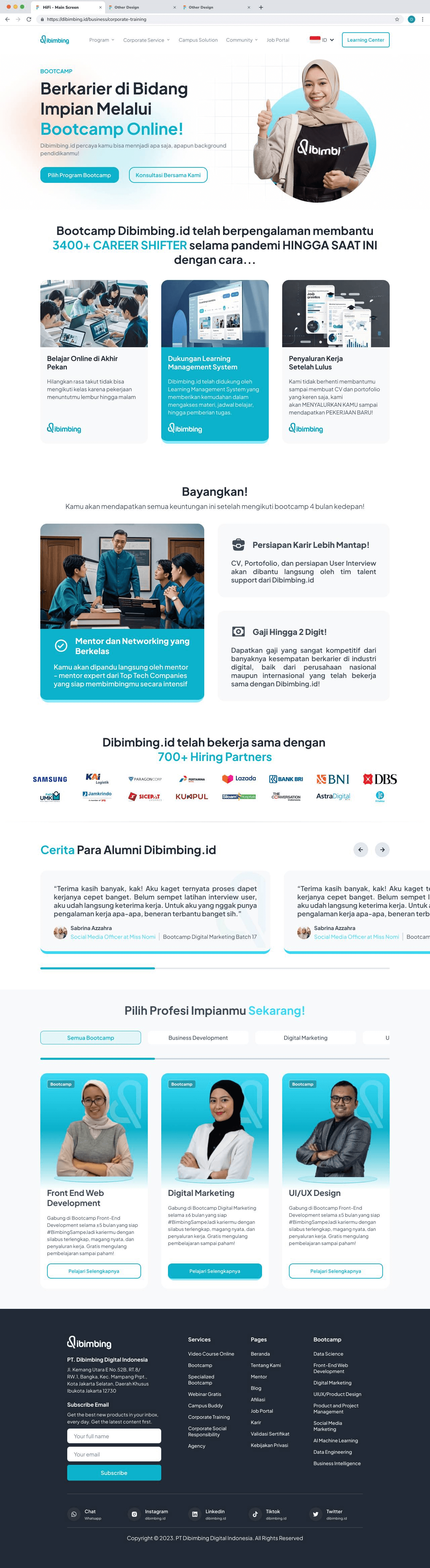
Dibimbing.id Bootcamp & Blog Redesign
My responsive website UI/UX redesign for Dibimbing.id’s Bootcamp and Blog sections during my Kampus Merdeka (MSIB) internship, using Figma Auto Layout and a consistent design system.
PROJECT INFORMATION:
Category:
Design Revamp
Role:
UI/UX Designer
Organizer:
Dibimbing.id x Kampus Merdeka (MSIB)
Location:
South Jakarta, Indonesia
Tools:
Figma
Mentor:
Fachril Zulfidar
ABOUT
PT. Dibimbing Digital Indonesia
Dibimbing.id is a professional learning platform based in Indonesia, dedicated to helping individuals build skills in tech, design, business, and more. It serves as a hub for learners seeking guided mentorship, real world projects, and industry relevant knowledge. With its structured learning paths, bootcamps, and career development programs, Dibimbing.id empowers students, professionals, and career switchers to grow confidently and be ready for the digital workforce.
CONTEXT
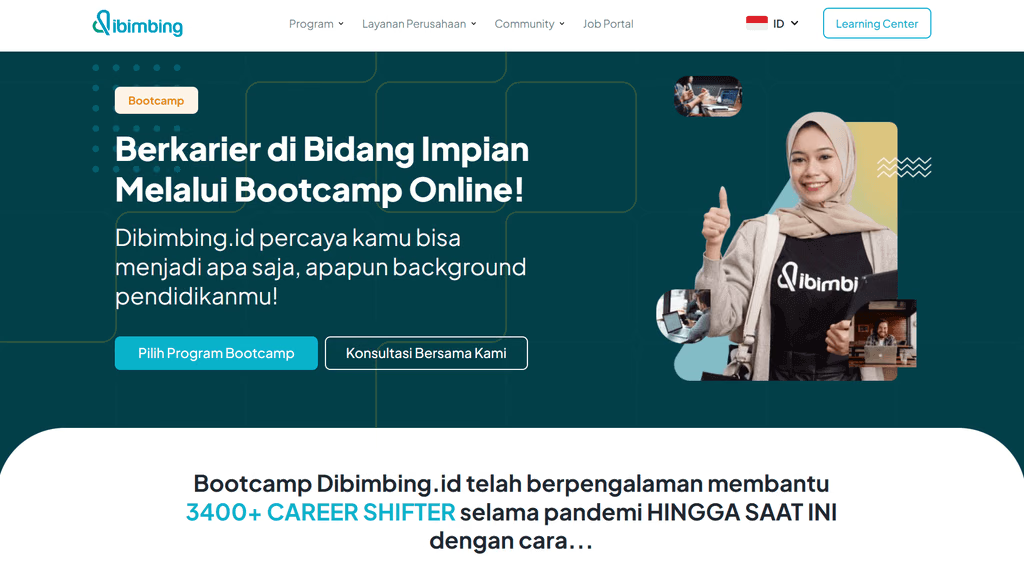
Bootcamp & Blog Section
This was one of the tasks assigned to me during the internship. The goal was to revamp Dibimbing.id’s Bootcamp and Blog sections with a fresh look while staying true to the brand’s existing colors, typography, and identity.
CHALLENGE
Branding
The main challenge was to design a modern, clean layout that not only improves the browsing experience but also keeps users engaged and makes exploring content effortless all while staying consistent with Dibimbing.id’s branding.
PROCESS
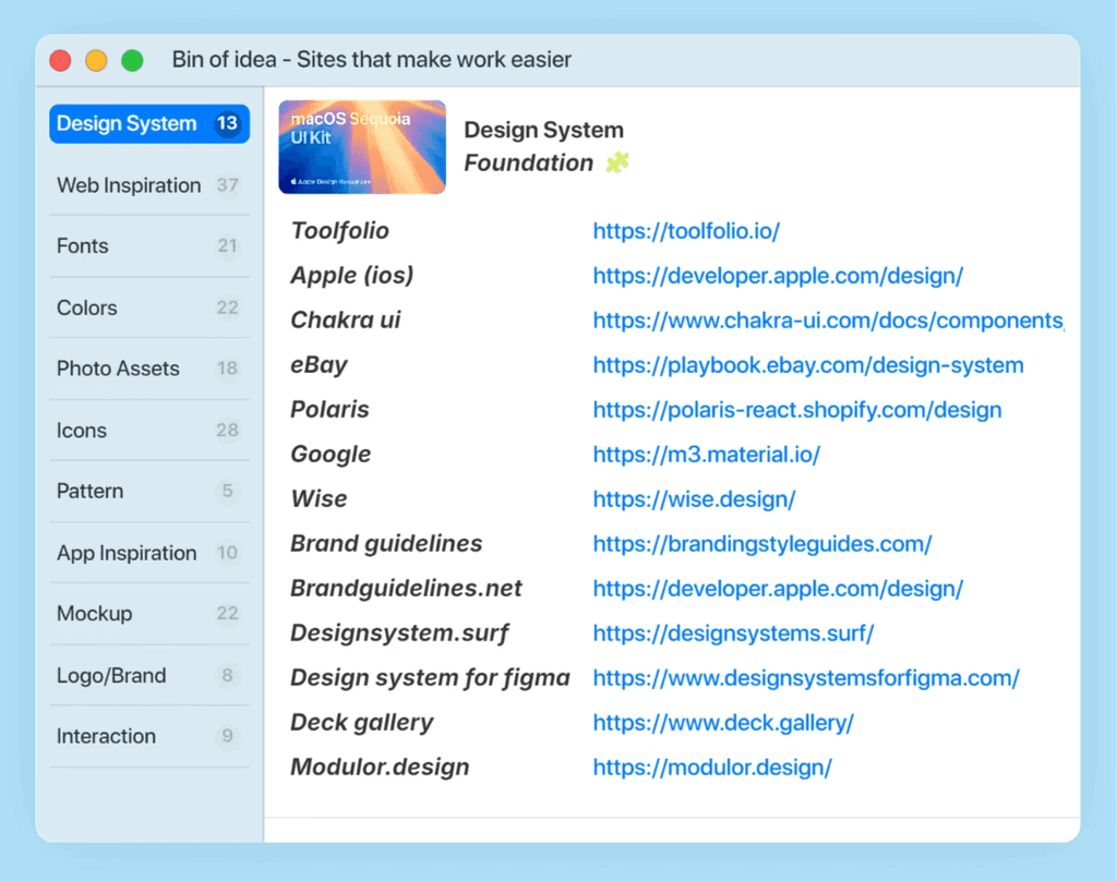
Inspiration
After receiving the task, I began by search for inspiration and studying Dibimbing.id’s existing design style and gathering inspiration from modern layouts. This helped me understand how to maintain the brand identity while introducing a fresh, user friendly interface.
During the process, I also built the design based on design system and applied fully auto layout in Figma. This made the design scalable and easy to maintain, ensuring consistency and efficiency across all pages. It was a great learning experience in combining structure, creativity, and practicality into one cohesive system.
SOLUTION
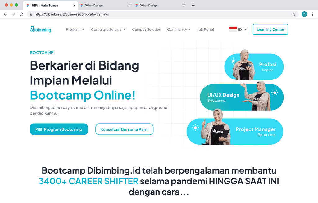
For the redesign, I experimented with multiple layout options, focusing on key elements like the hero section, card components, and the overall color palette. Each variation was carefully crafted to stay true to the brand while introducing a cleaner and more modern aesthetic. The final design strikes a balance between brand consistency and fresh visual appeal, making the Bootcamp and Blog sections more engaging and enjoyable to explore.
Preview