HR Recruitment Dashboard UI/UX Case Study
Recruitment dashboard UI/UX design for high-volume hiring pipelines and candidate management.
It replaces manual scanning and slow status updates with visual priority signals, automated bottleneck detection, and progressive information architecture giving recruiters clarity and control without the cognitive overload. This project is a design case study created as part of my application for a UI/UX Designer role at an HR Solution company. It resulted in a full job offer after passing every interview stage HR, hiring manager, and CEO.
BUSINESS CONTEXT
As part of the UI/UX Designer application process, I was given a take home assignment to design a recruitment board that works for power users senior recruiters managing multiple departments, tight deadlines, and dozens of candidates at once. The goal wasn't just visual polish; it was to solve a real operational problem that recruiters face daily.
PROBLEM FRAMING
User: Senior recruiter, 4+ years of experience
Situation: Managing 50+ candidates across departments within a 2 week hiring window
The core problem: existing tools create visibility loss at scale. The more candidates in the pipeline, the harder it is to know what needs attention so recruiters end up spending more time managing the board than making actual hiring decisions.
PAIN POINTS & HOW I SOLVED THEM
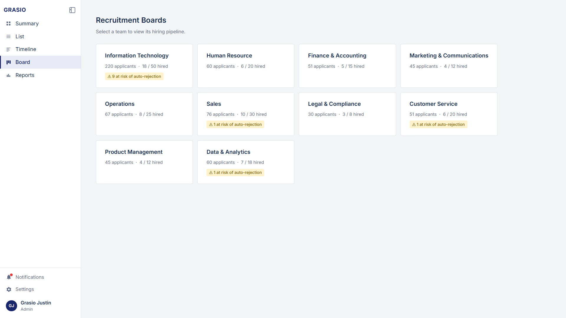
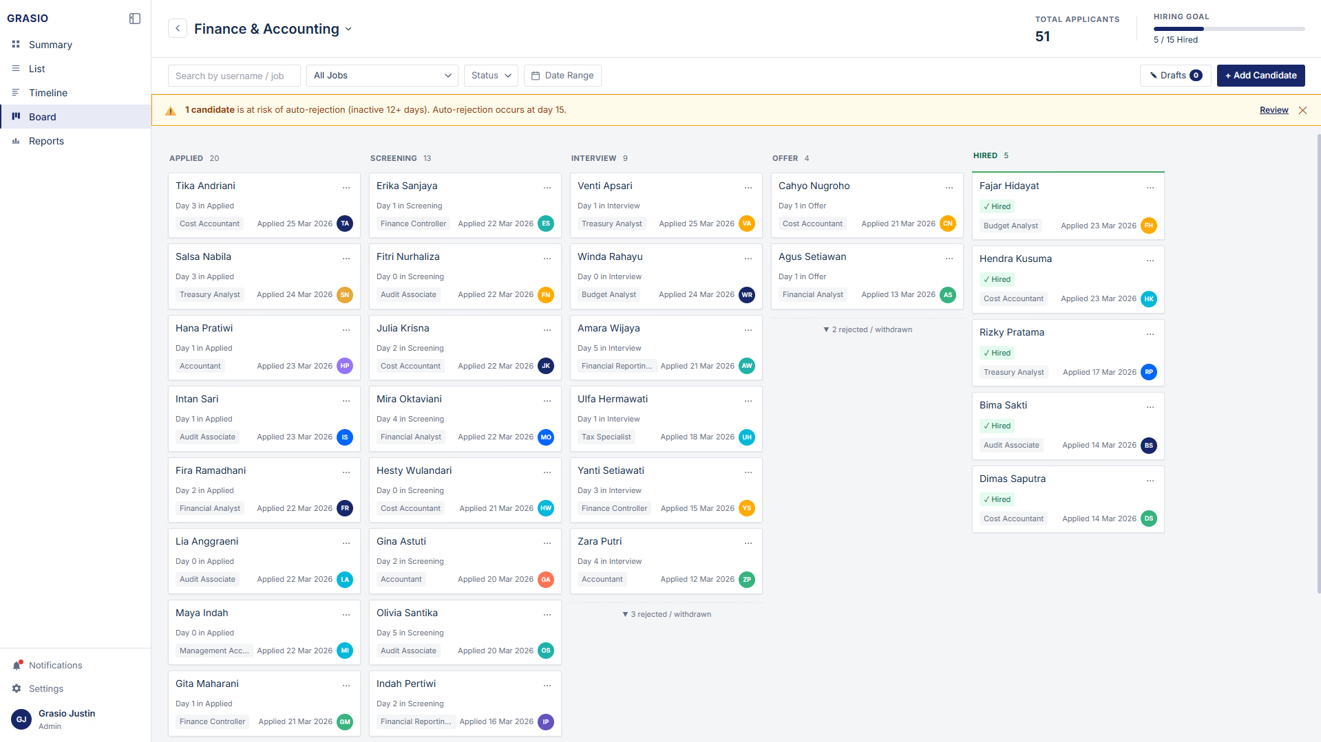
1. No hiring progress overview Hard to know how close they are to the goal at a glance.
Hiring Progress Tracker with a live progress bar per department (e.g., "12 / 50 Hired")
Independent targets per category for concurrent hiring campaigns
Real-time updates when candidates move to the HIRED stage
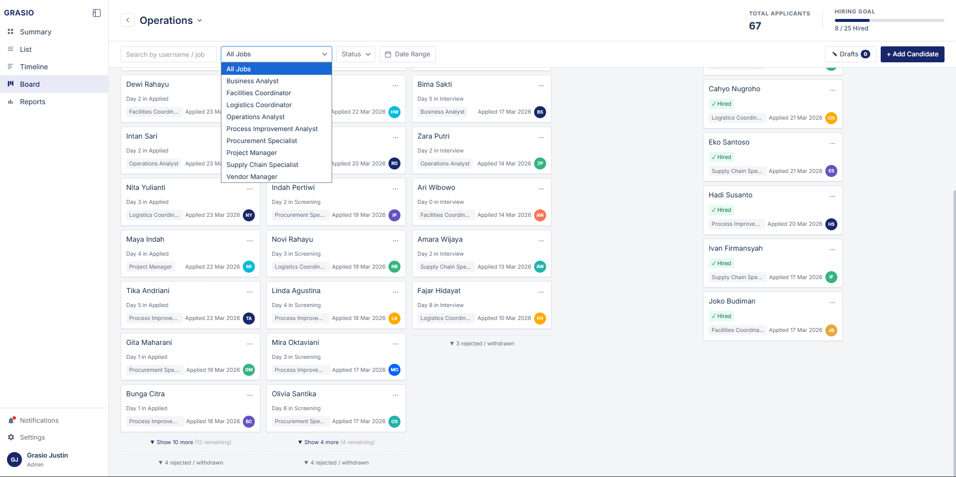
2. Too many cards at once cluttered and overwhelming. The board breaks down visually when volume increases.
Smart Pagination -> columns default to 10 cards, with "Load more" on demand
Progressive Disclosure -> users control information density, expanding only what they need
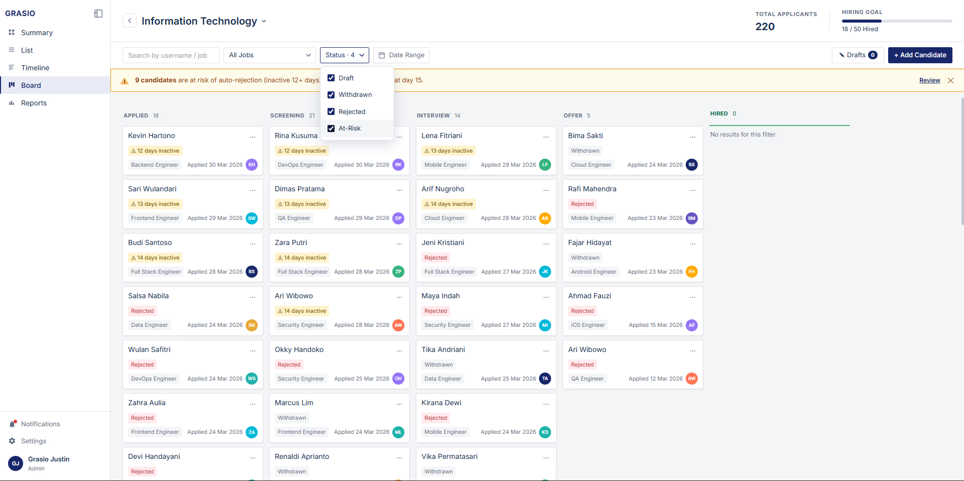
3. No priority signals all cards look the same Urgency is invisible until it's too late.
Three tier visual system using colored dots and tags: Default (gray) -> Slowing (amber) → Hired (Green) Rejected (red)
Multi select status filter and a one click Stuck only toggle for instant triage
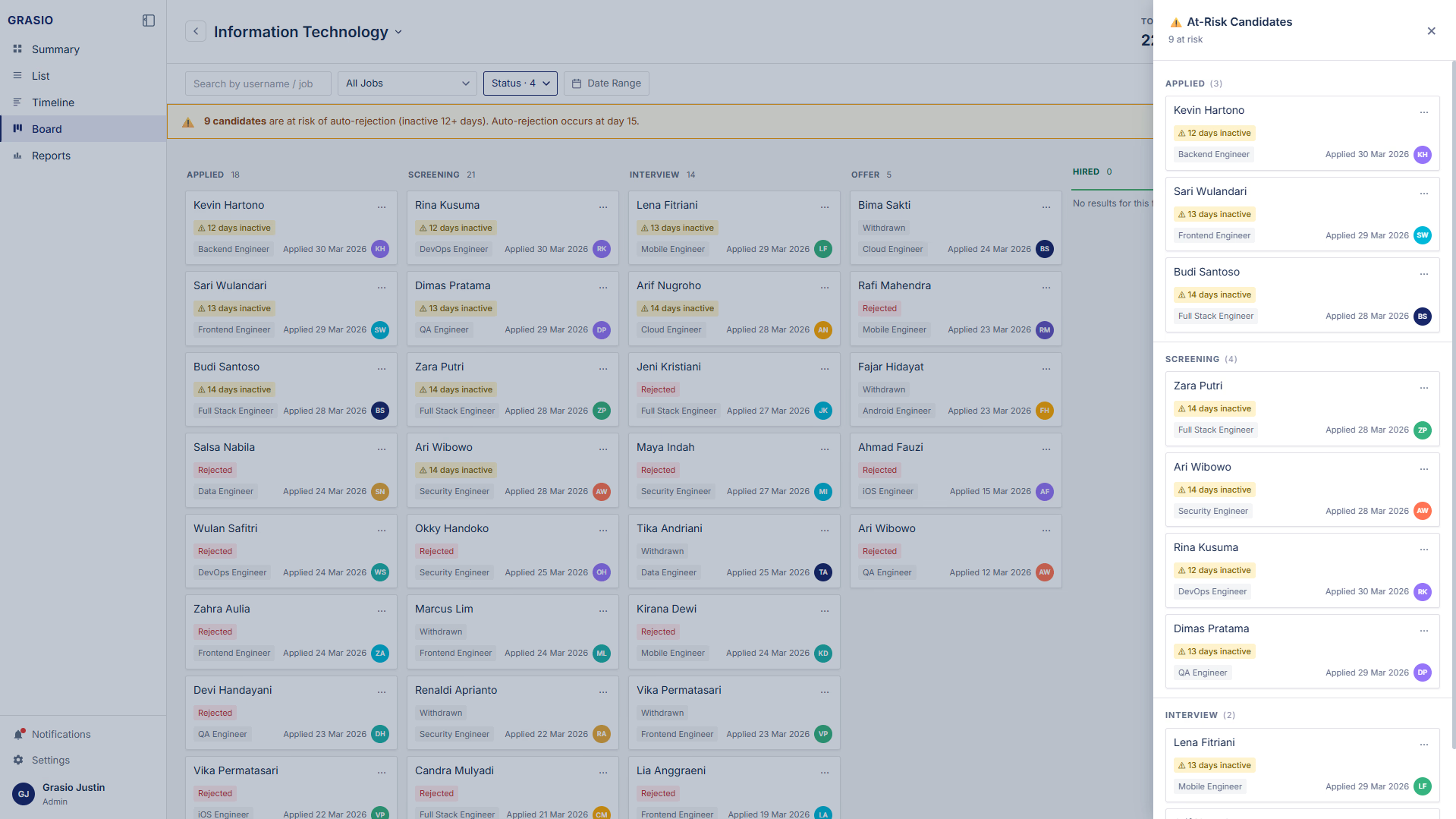
4. No way to spot stuck candidates without manual scanning Recruiters waste time looking for problems instead of solving them.
At Risk Banner -> floating alert showing candidates at risk of auto-rejection (inactive 12+ days)
Risk Drawer -> slide out panel grouping all at risk and snoozed candidates by stage
Auto rejection Countdown -> creates urgency before day 15 cutoff
Snooze Function -> pause warnings for candidates legitimately under review
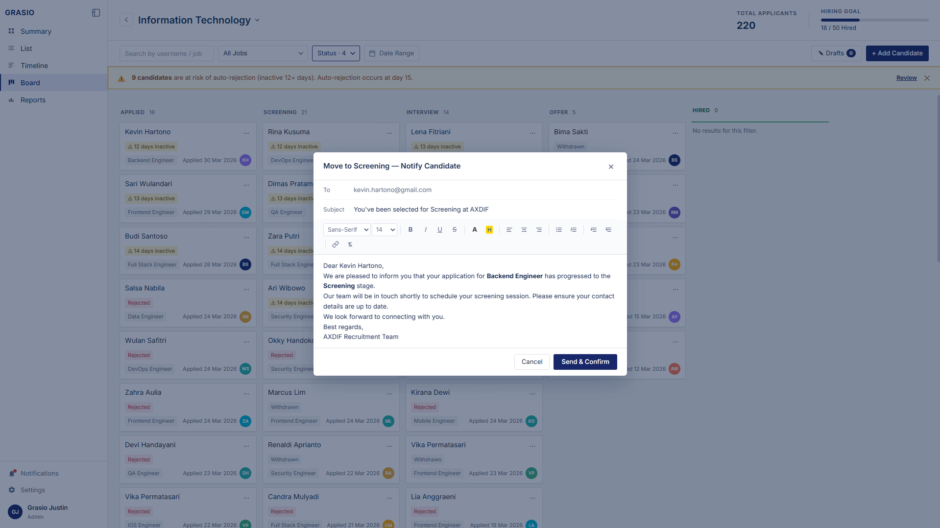
5. Manual status updates are slow Every move requires too many clicks.
Drag and drop stage advancement with a confirmation modal to prevent accidental moves.
Stage validation rules that enforce hiring logic no skipping, no moving backward
EXECUTION
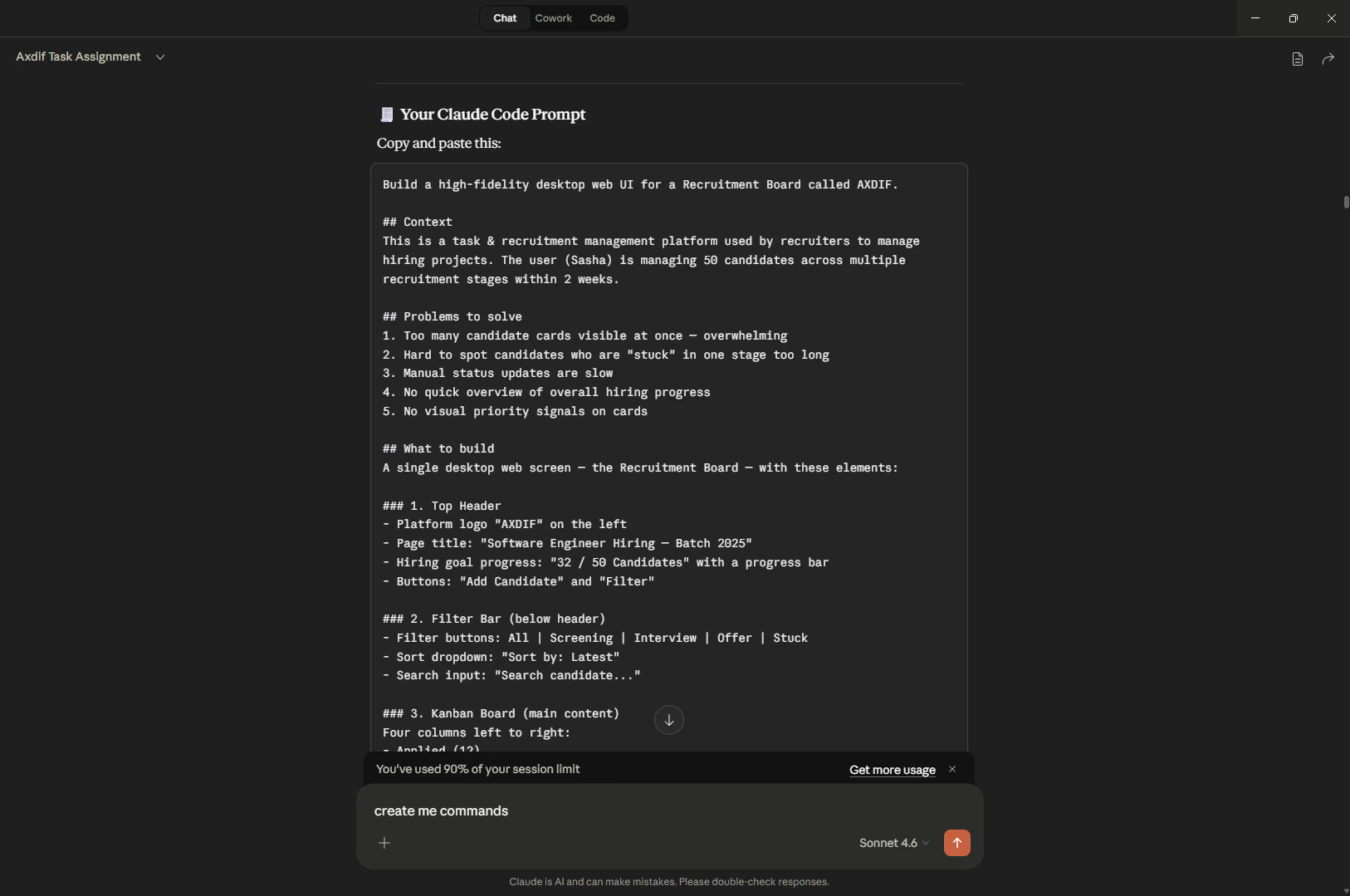
Brainstorming & PRD in Claude
I start by coming to Claude to do structured brainstorming defining the user persona, pain points, edge cases, user stories, and functional requirements. This helps me build a solid foundation before touching any design tool, so every decision I make later is grounded in real product thinking.
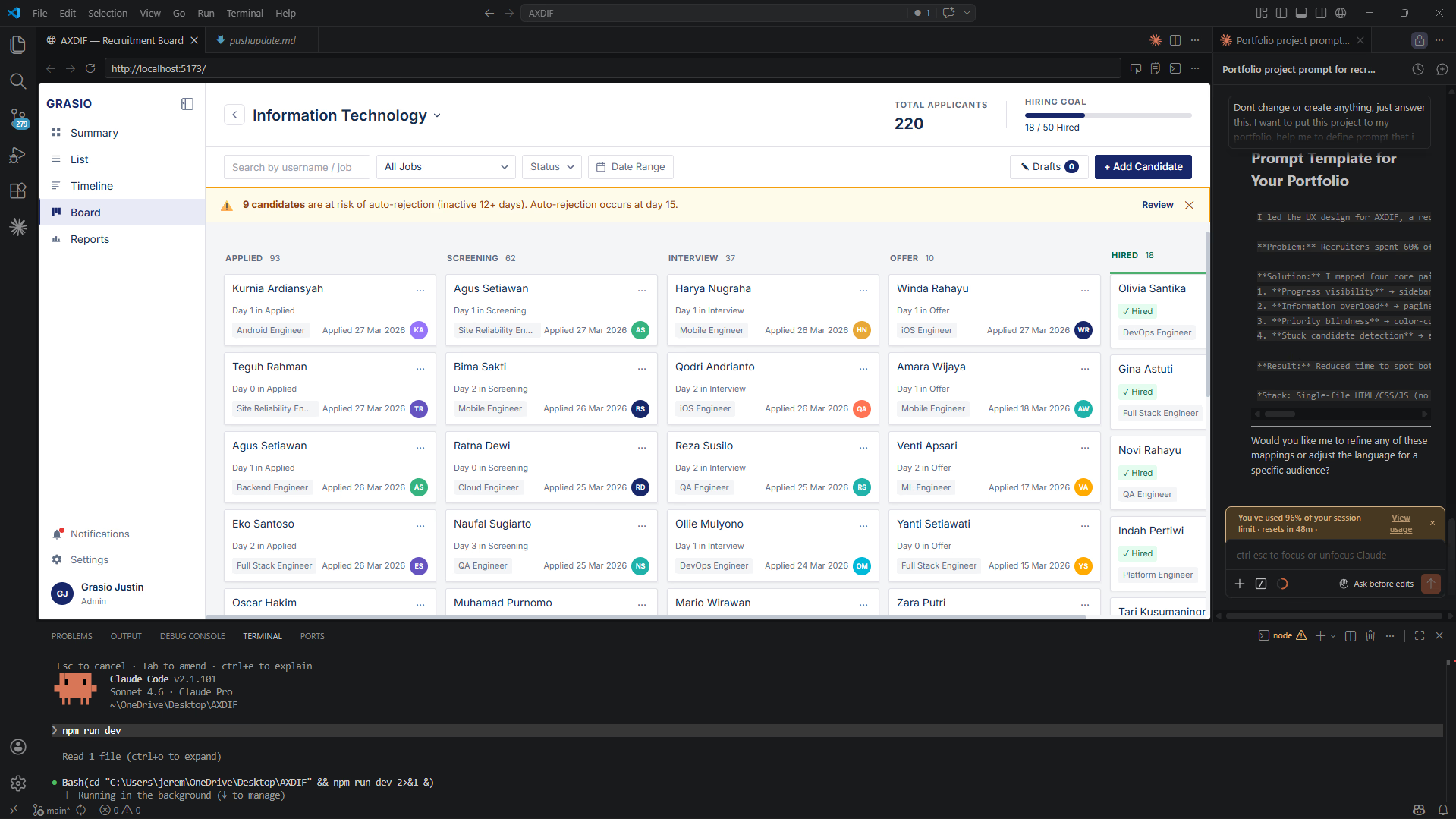
Time was tight I was juggling a side job and full office hours alongside this assignment. So instead of going through the usual design process, I went straight to Claude Code to build both the design and interactive prototype at the same time. All visuals and interactions were generated through Claude Code from the start.
This wasn't just a shortcut it was a smart call. I still delivered a complete, detailed solution, just faster. And it paid off the panel actually called it out as one of the highlights during the interview.
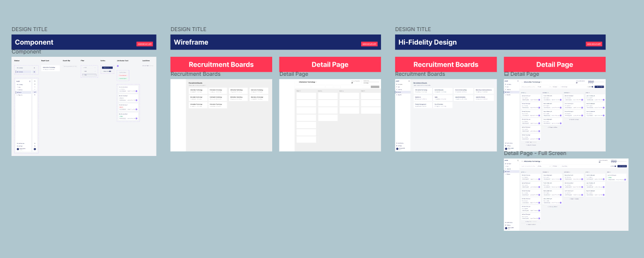
Using Claude Code with Figma MCP integration, I could work in both directions exporting designs from Claude Code directly to Figma canvas, and pulling assets from Figma back into Claude Code. This two way connection also carried over the full design system, keeping everything consistent and structured throughout the process.
GLIMPSE
RESULT
Cleared every interview stage: HR screening, hiring manager review, and CEO presentation. The panel specifically highlighted the innovative use of Claude Code as a workflow accelerator, recognizing it as a signal of how I approach design: practical, resourceful, and outcome driven.
Outcome: Received a full job offer.