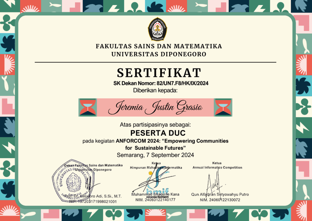
UI/UX Design Competitions — BASIC, INSPACE, ISFEST & ANFORCOM
Explore Jeremia Justin Grasio's UI/UX competition projects: BASIC BINUS, INSPACE ITK, ISFEST UKSW, UDINUS, and ANFORCOM UNDIP.
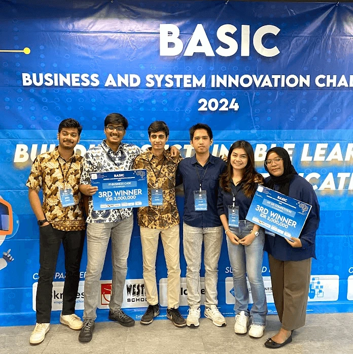
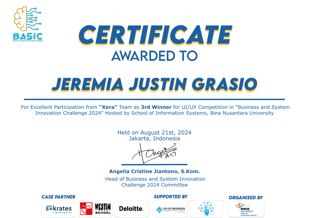
BASIC BINUS UI/UX Competition — Third Place
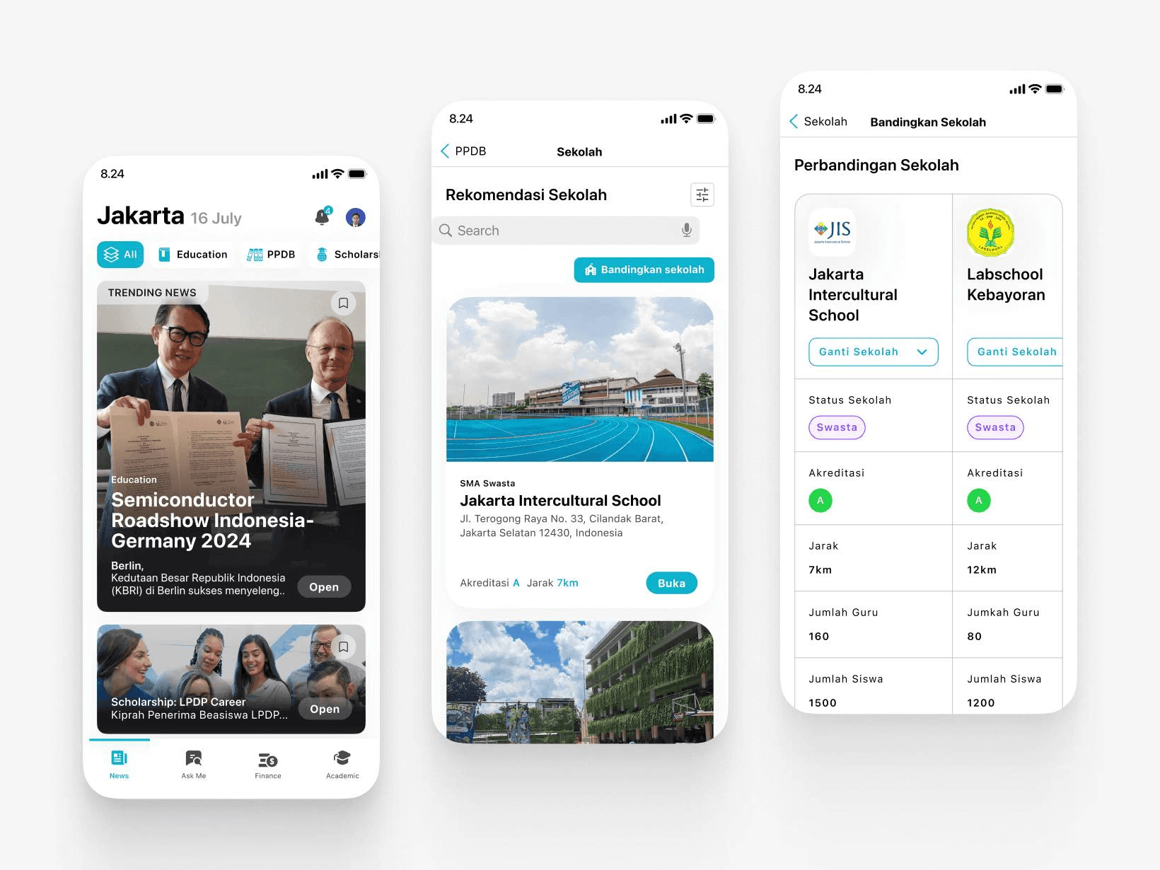
BASIC BINUS UI/UX — 3rd Place
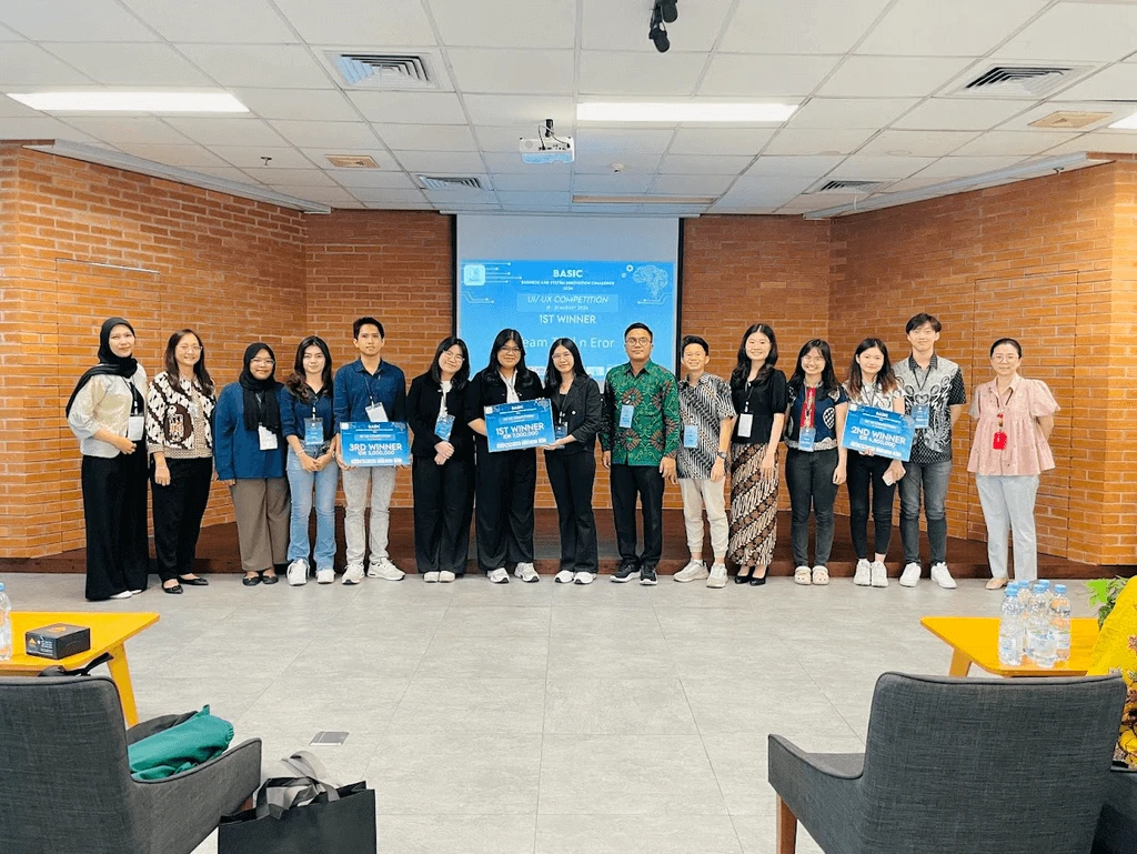
My third-place BASIC (Business and System Innovation Challenge) UI/UX competition project at BINUS: an education app inspired by Sokrates, designed in a 24-hour final.
PROJECT INFORMATION
Category:
UI/UX Competition
Role:
UI/UX Designer
Organizer:
Bina Nusantara University
Location:
BINUS Taman Anggrek
Team:
Shiva Augusta, Priksa Trisna
Tools:
Figma, Canva
ABOUT
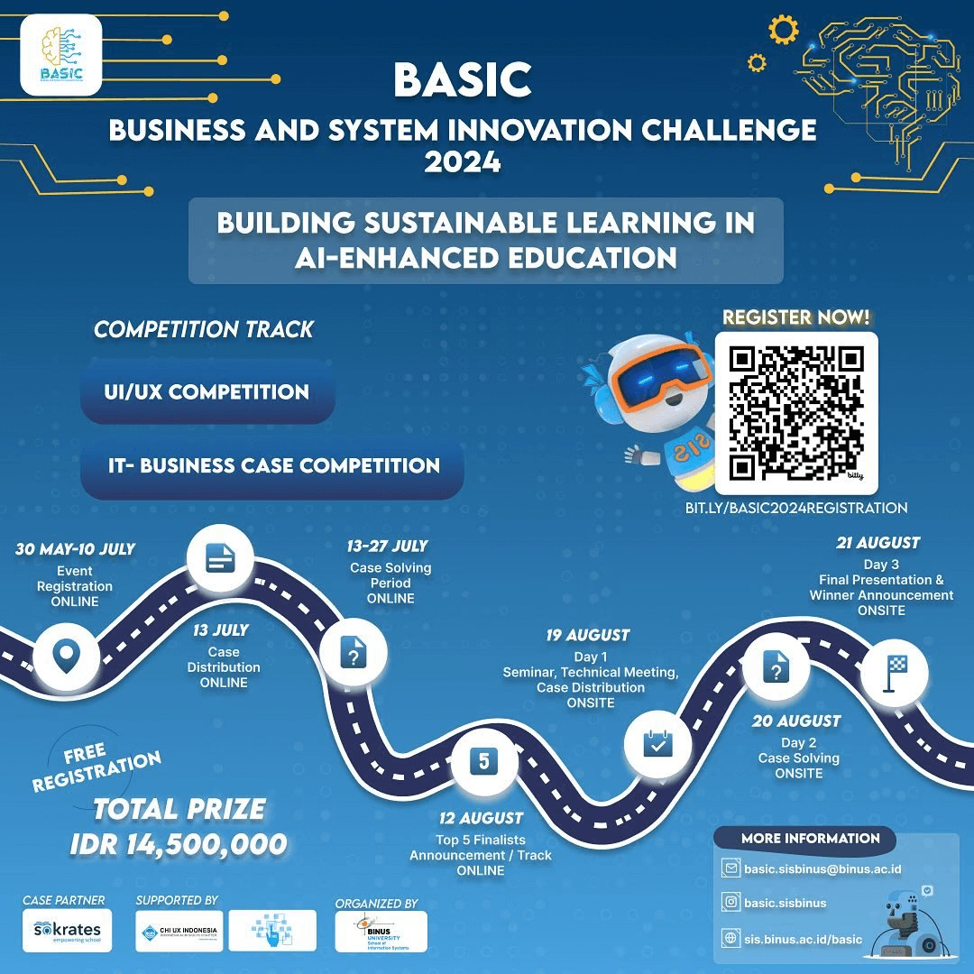
BASIC — Business and System Innovation Challenge
The challenge was hosted by Bina Nusantara University in collaboration with Skorates, a leading provider of digital solutions for education in Indonesia. Skorates supports schools in digital transformation through learning platforms, teacher training, and IT infrastructure. The competition aimed to inspire students to create innovative digital solutions to modernize education in Indonesia.
CONTEXT
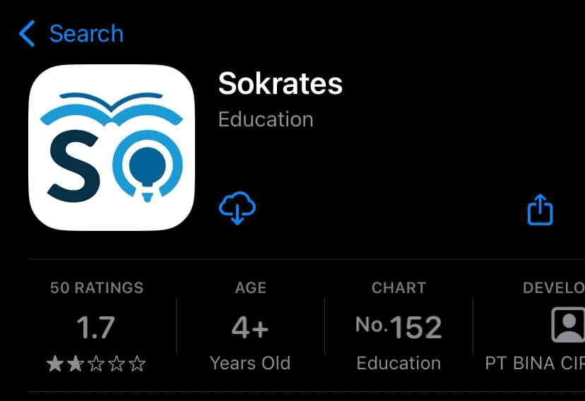
Sokrates App
We were tasked with designing a platform inspired by the Sokrates App, which integrates multiple features such as:
School Information System (admission, LMS, e-raport, e-finance, e-library)
Digital Content (ICT and non-ICT learning materials, virtual labs, robotics)
Teacher Professional Development (Merdeka Mengajar, digital learning modules)
School IT Infrastructure (consultation, implementation, maintenance)
CHALLENGE
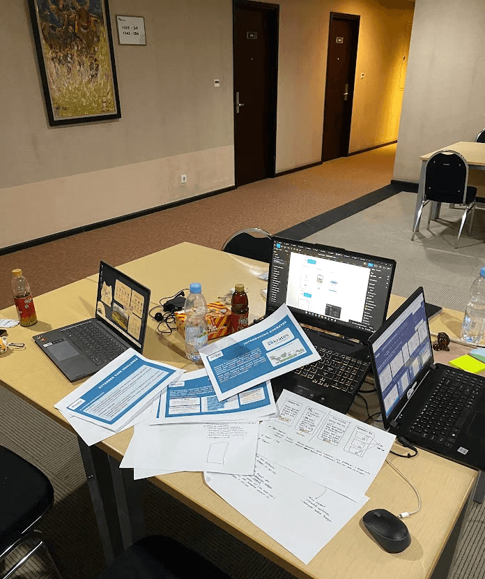
24 Hours Live Design
In the final round, the organizers gave us 24 hours to complete the case study. We were free to manage our time however we wanted whether to relax, rest, or work continuously as long as the final solution was submitted on time. We maximized the entire 24 hours to design a mobile platform that integrated AI features to enhance the educational experience.
PROCESS
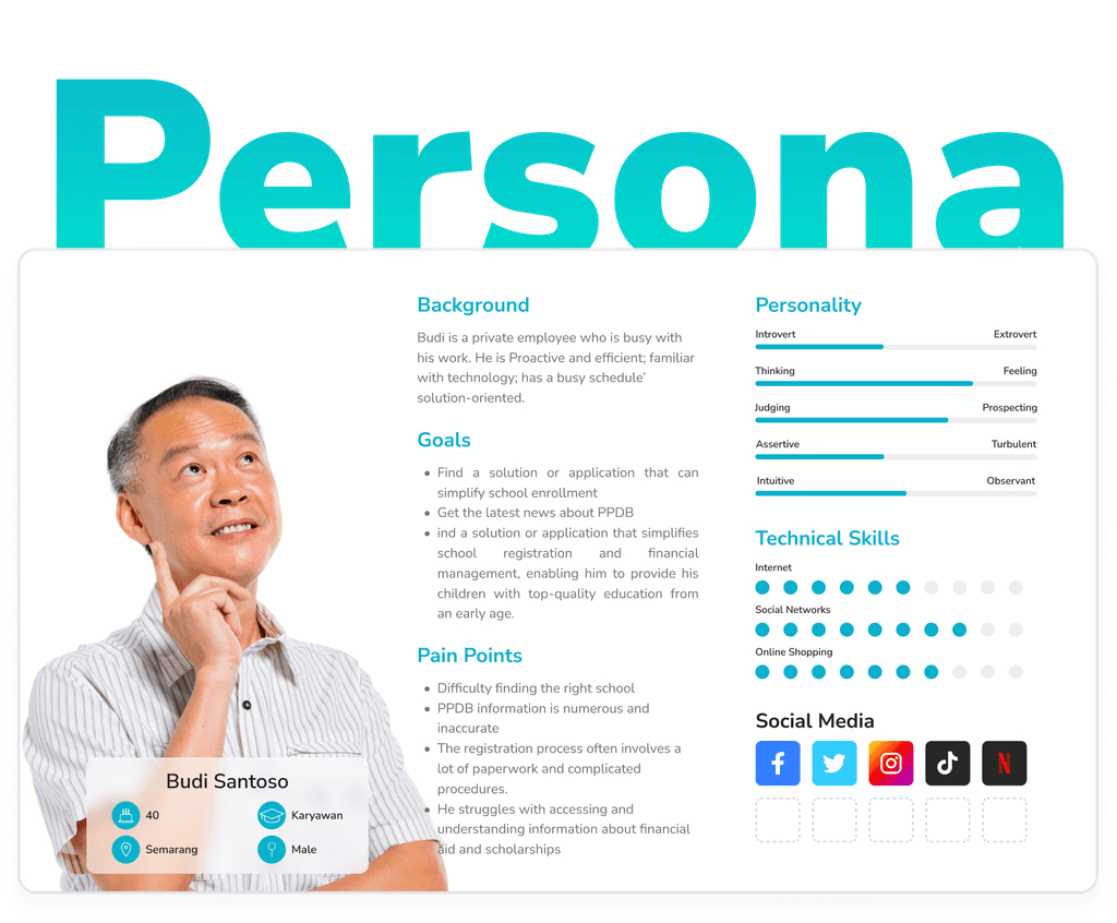
User Persona
We created "Budi Santoso," a busy parent seeking a simpler way to manage his child’s school enrollment. His struggles with complex procedures and scattered information guided our design decisions for a more intuitive user experience.
Platform Requirements
We mapped out:
Financial Platform: Online payments, scholarship applications, real-time tracking, and transparency features.
Academic Testing Platform: Centralized scheduling, result management, and real time analytics.
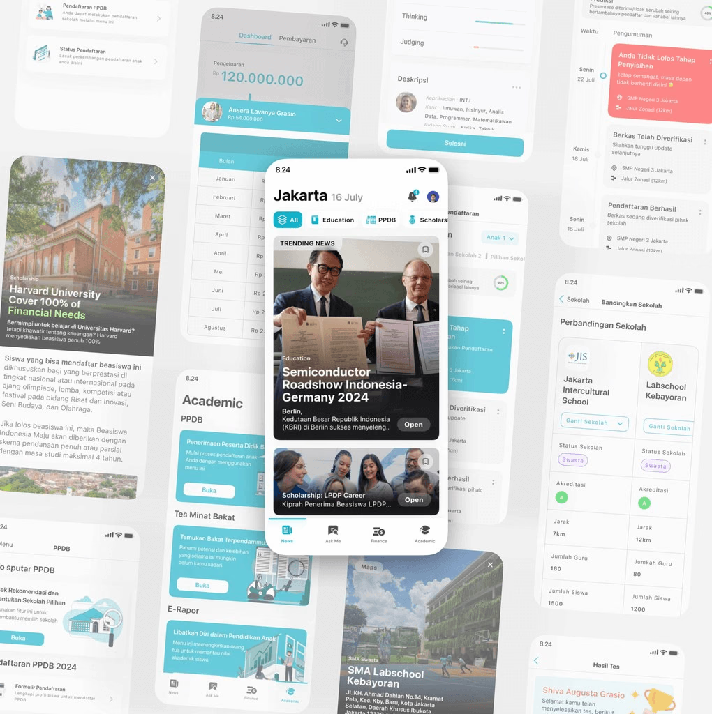
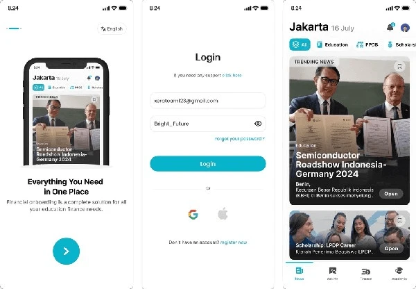
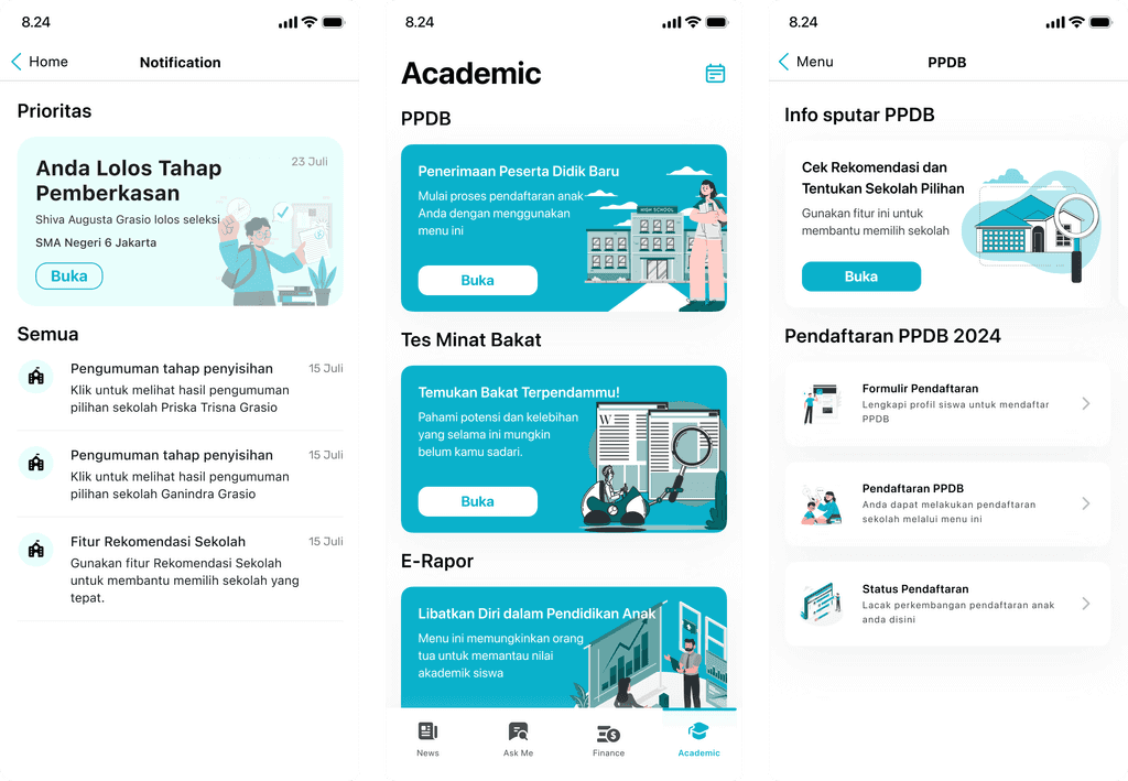
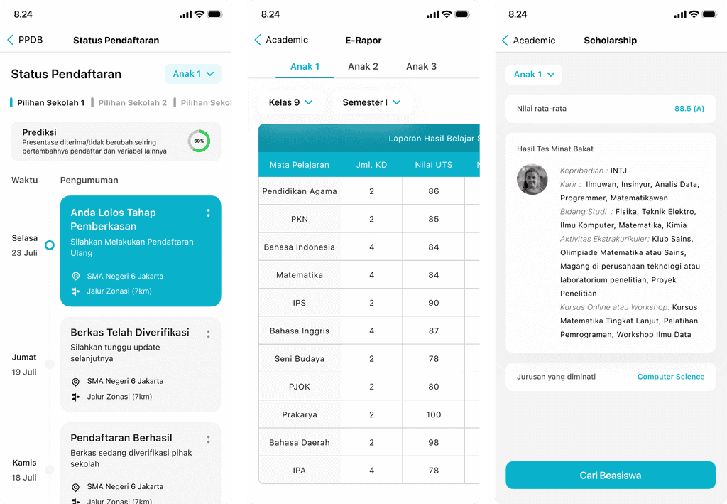
Hi Fidelity Design
Before the final, we submitted wireframes. During the 24 hour challenge, we enhanced them with the new case requirements.
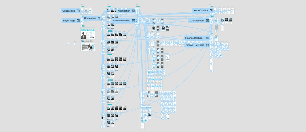
Prototype
After completing the hi fidelity design, we moved on to creating the interactive prototype. This allowed us to transform the static screens into a fully clickable experience, making it easier to demonstrate user flows and validate the overall usability of the platform.
PREVIEW
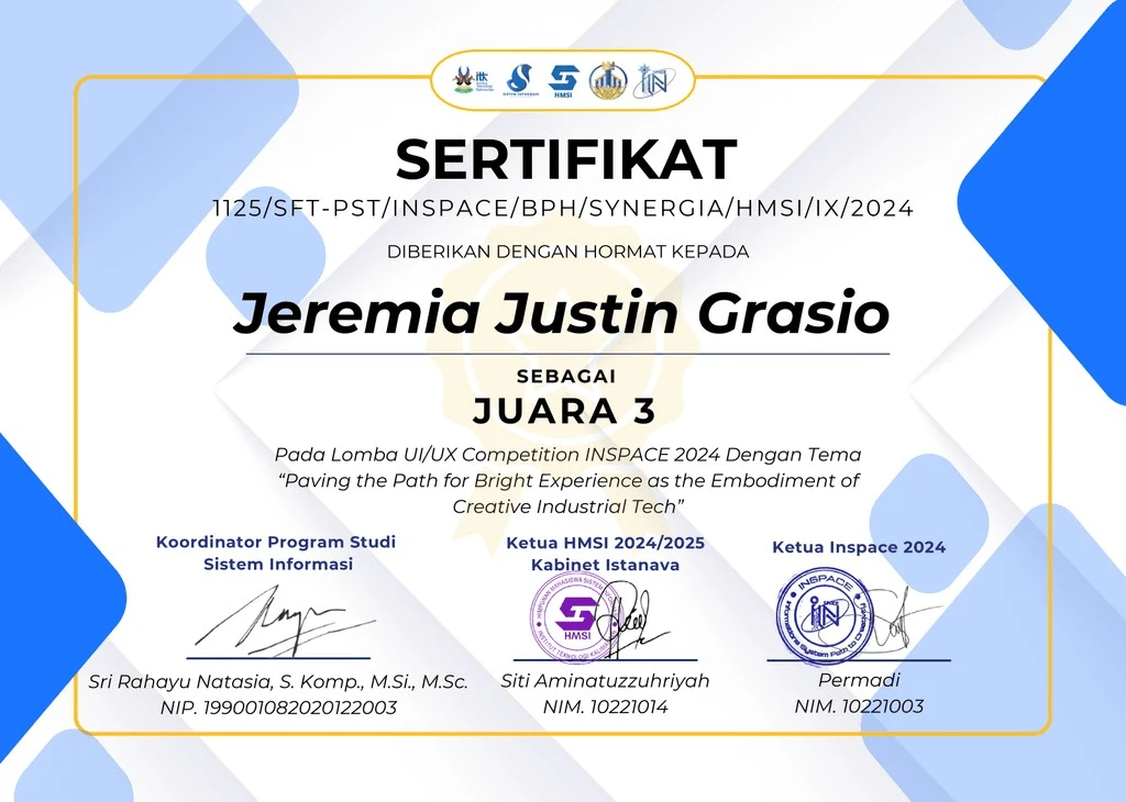
INSPACE ITK UI/UX Competition — Third Place
INSPACE ITK UI/UX — 3rd Place
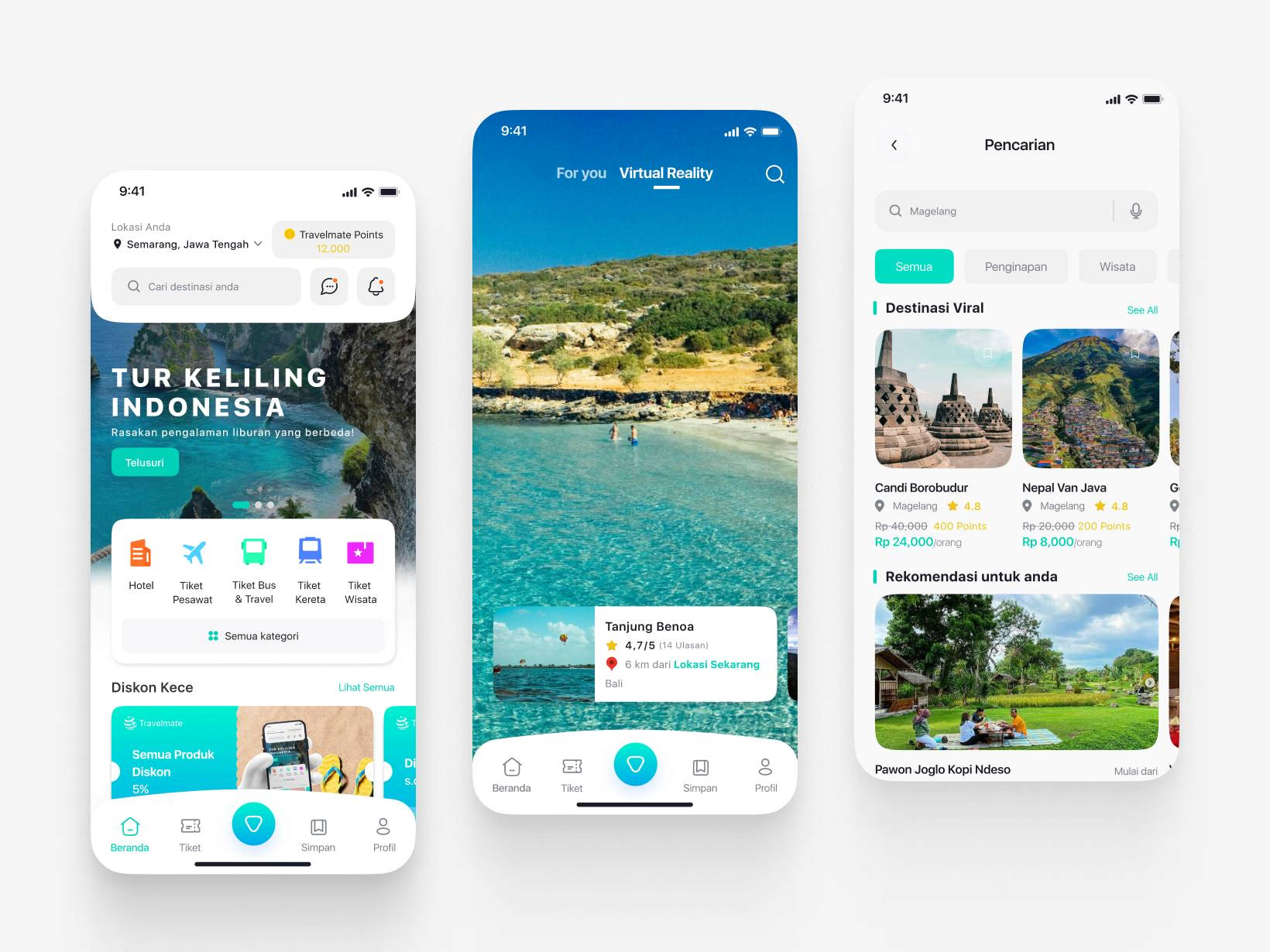
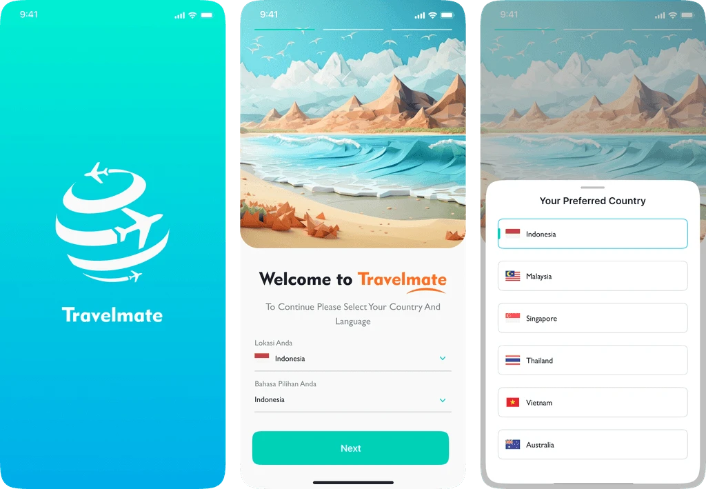
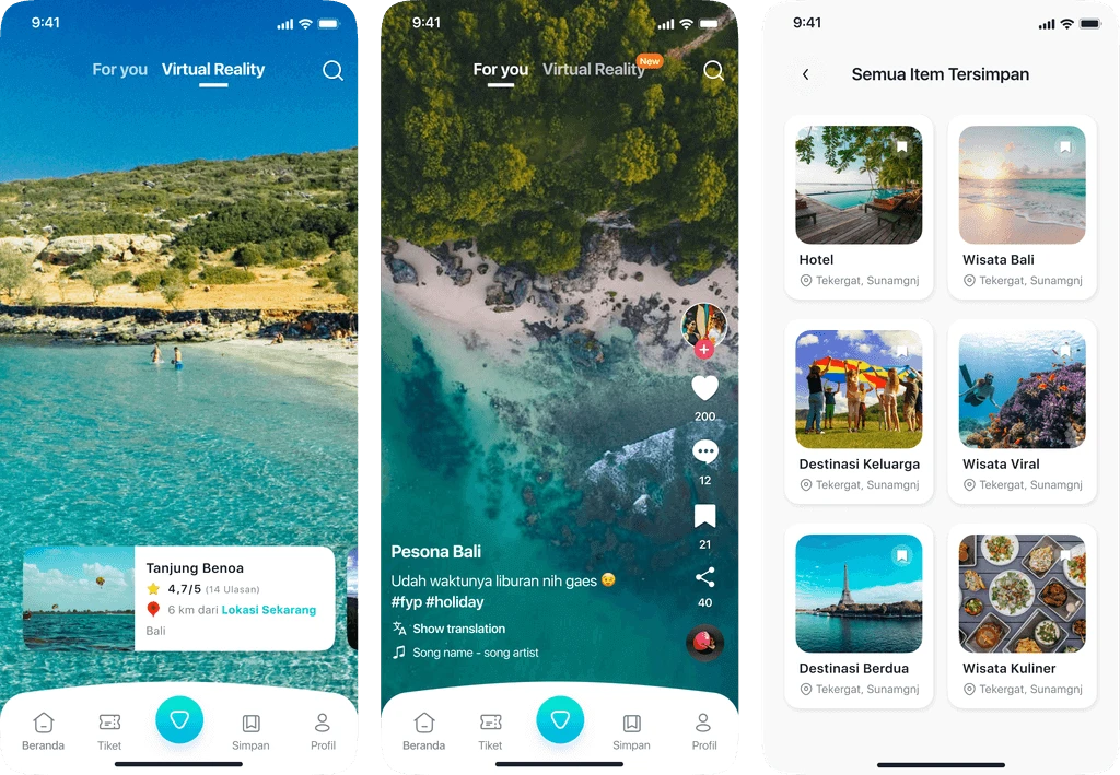
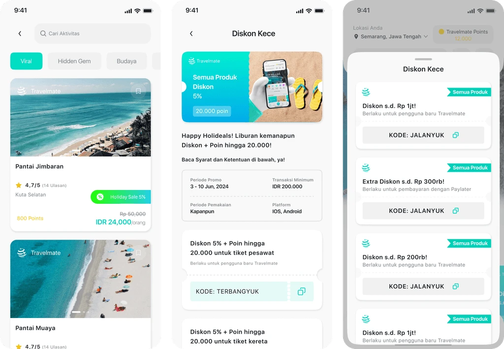
My third-place INSPACE UI/UX competition project at Institut Teknologi Kalimantan (ITK): Travelmate, a travel app concept with virtual reality exploration.
PROJECT INFORMATION
Category:
UI/UX Competition
Role:
UI/UX Designer
Organizer:
Institut Teknologi Kalimantan (ITK)
Location:
Online
Team:
Naufal Mussyafa
Duration:
3 Weeks
Tools:
Figma
ABOUT
INSPACE Competition
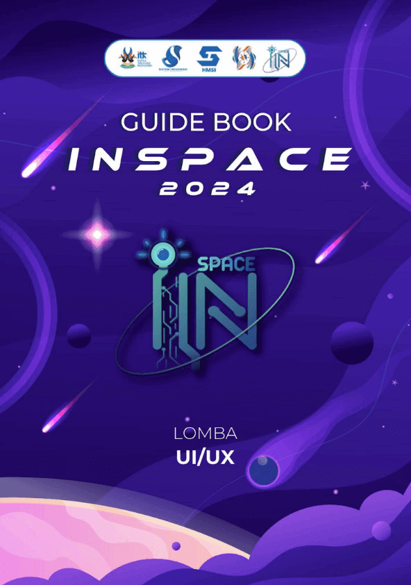
INSPACE Competition is a UI/UX event hosted by the Institute Technology of Kalimantan, featuring two categories: UI/UX Design and Business Plan. I joined the UI/UX category, where we were given five theme options. Our team chose the travel theme to create an innovative solution for travel planning.
CONTEXT
Virtual Reality
During research, I realized that most travel apps focus on bookings and recommendations but rarely offer immersive experiences. This inspired me to design an app that integrates Virtual Reality (VR), so travelers can explore destinations before they decide to go.
CHALLENGE

Unique Features
With so many travel apps already available, the real challenge was finding a unique feature that addresses user needs while standing out from the competition.
PROCESS
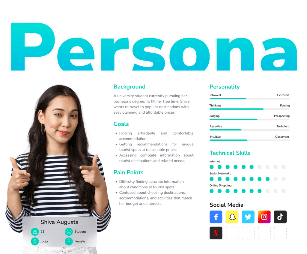
User Persona
We defined a traveler persona who loves affordable trips, wants easy access to reliable information, and often seeks inspiration online. They feel overwhelmed by scattered information and crave a simpler, clearer experience.
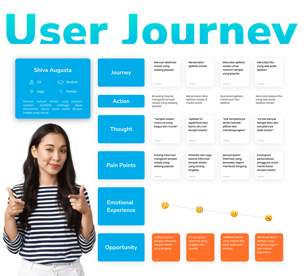
User Journey
We mapped out the traveler’s journey from searching online to booking trips identifying pain points like lack of personalization, confusing layouts, and incomplete details. This helped us pinpoint opportunities to make the app simpler, clearer, and more useful.
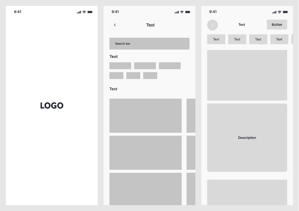
Wireframe
We created wireframes to outline the app’s structure, user flow, and content placement. Keeping the design simple at this stage made it easier to test ideas and collect feedback before building the final design.
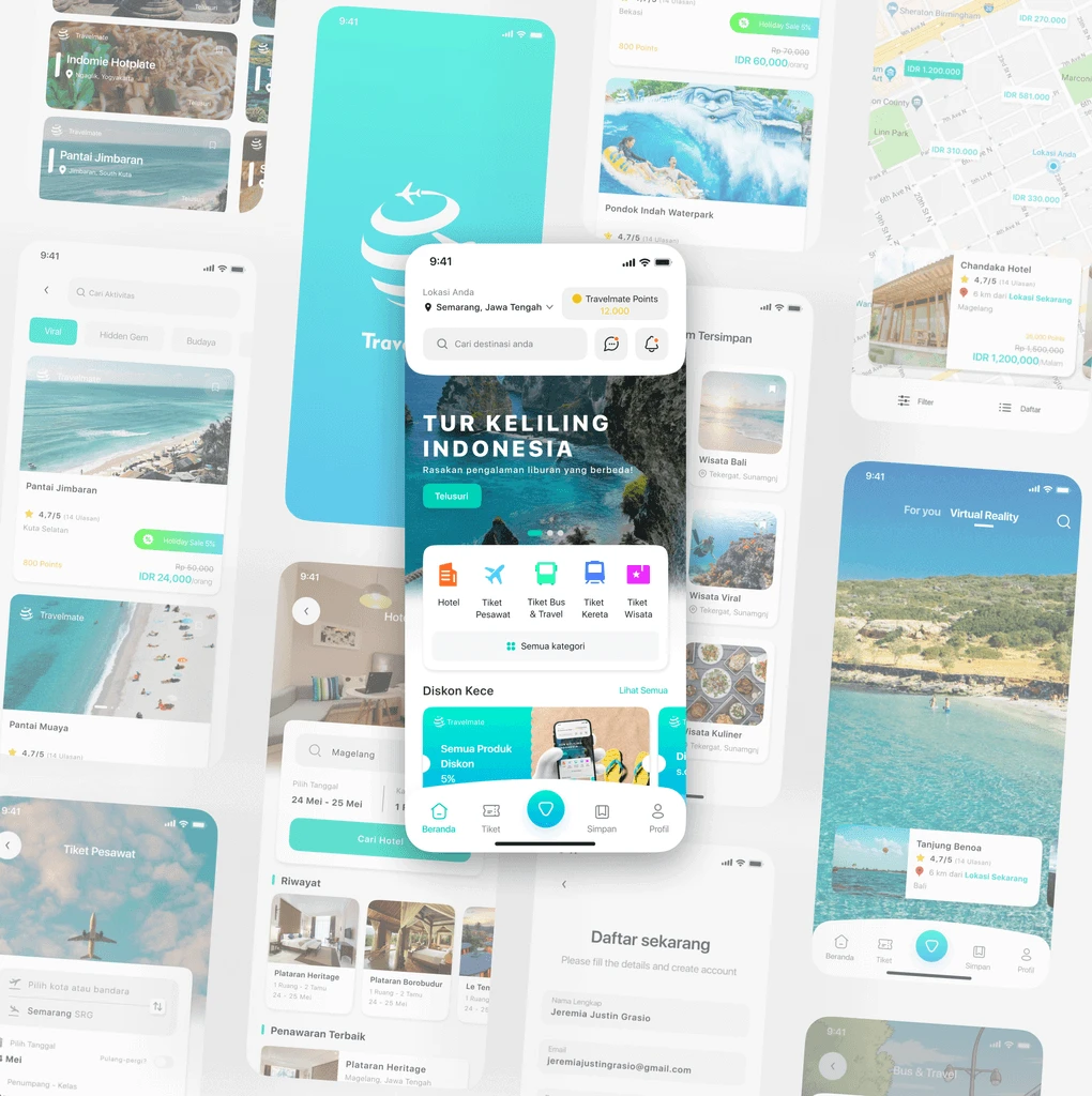
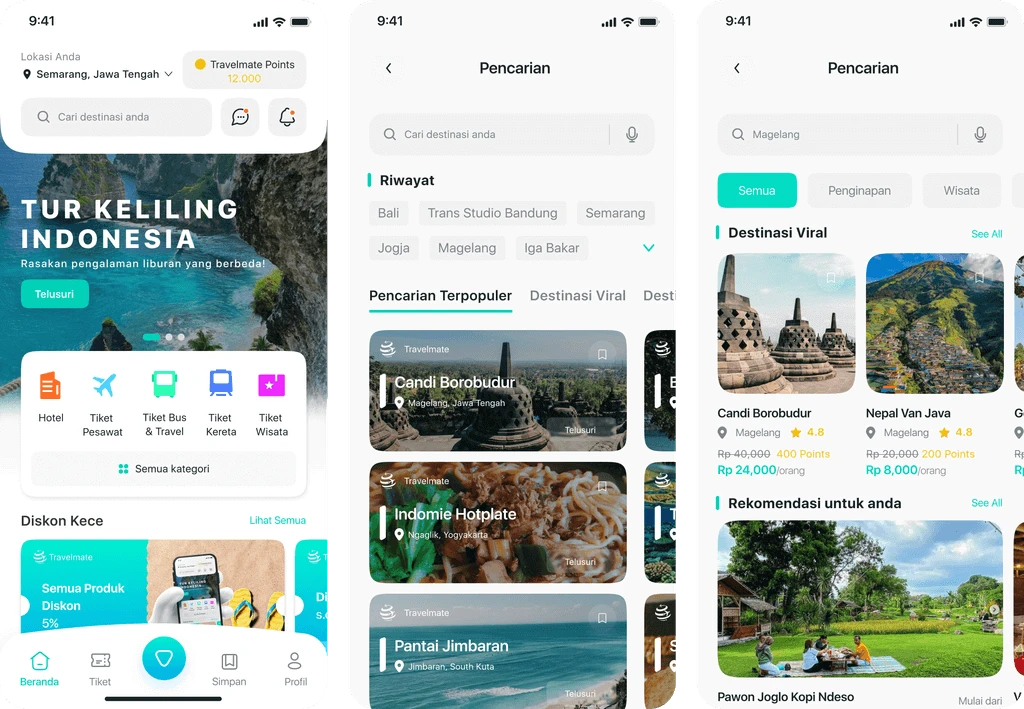
Hi - Fidelity Design
Once the structure was validated, we designed polished, visually appealing screens that aligned with the app’s purpose while maintaining clarity and ease of use.
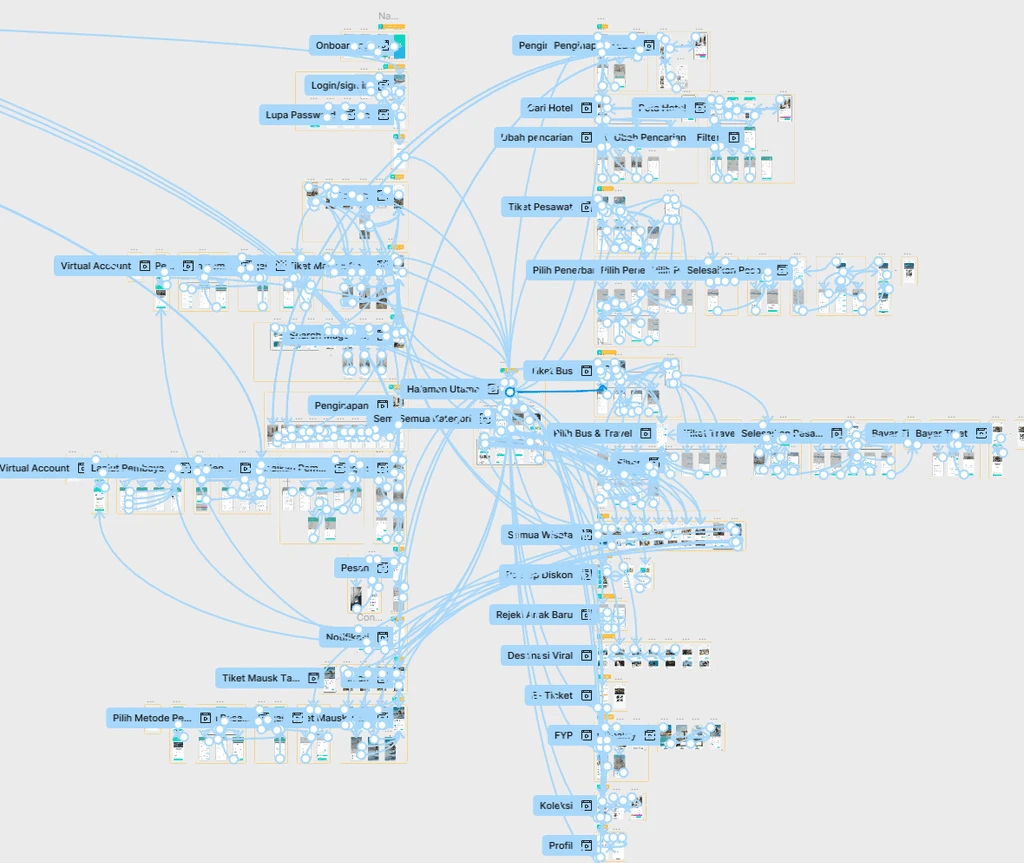
Prototype
Finally, we built an interactive prototype to simulate real user flows browsing destinations, booking accommodations, exploring VR views, and checking travel deals bringing the entire experience to life..
PREVIEW
ISFEST UKSW — 12-Hour UI/UX Design Competition
ISFEST UKSW — 12-Hour UI/UX Design
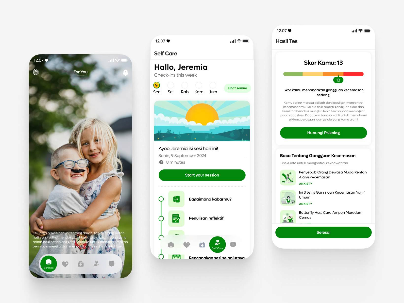
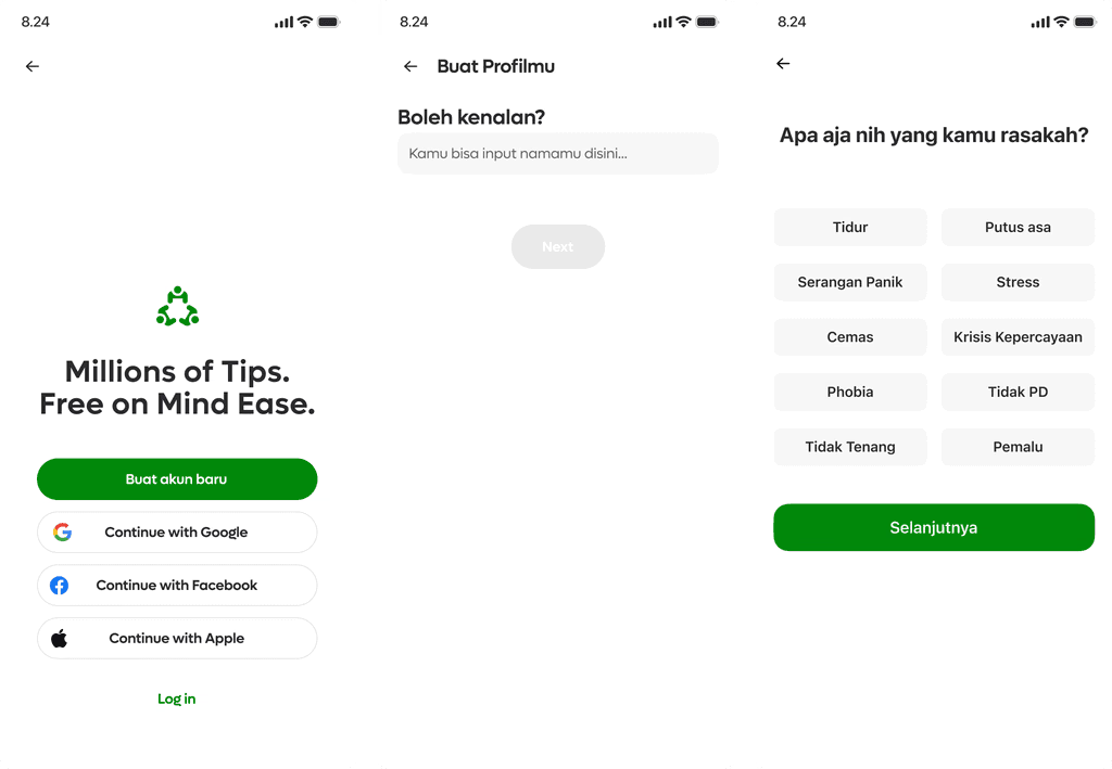
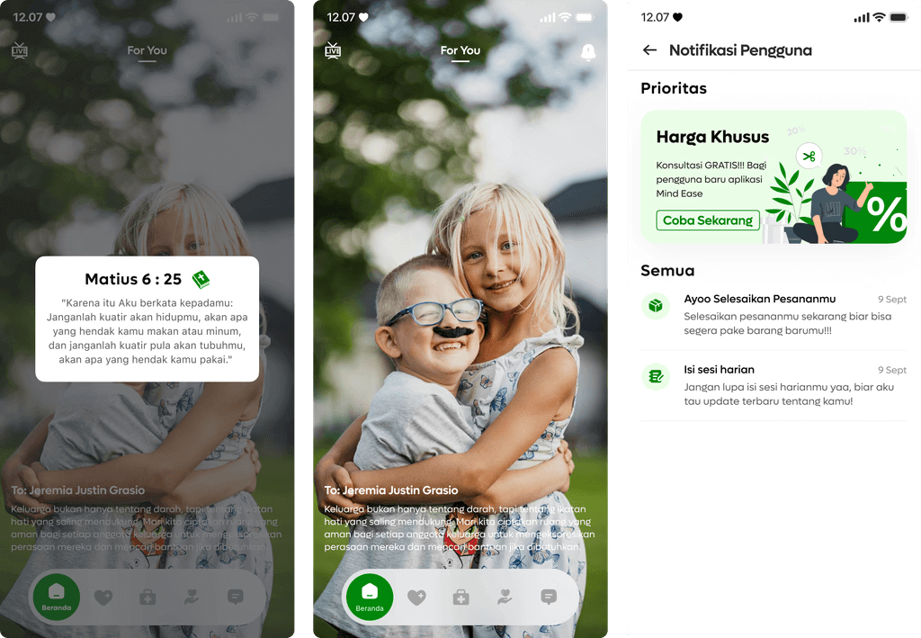
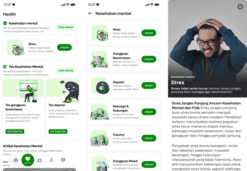
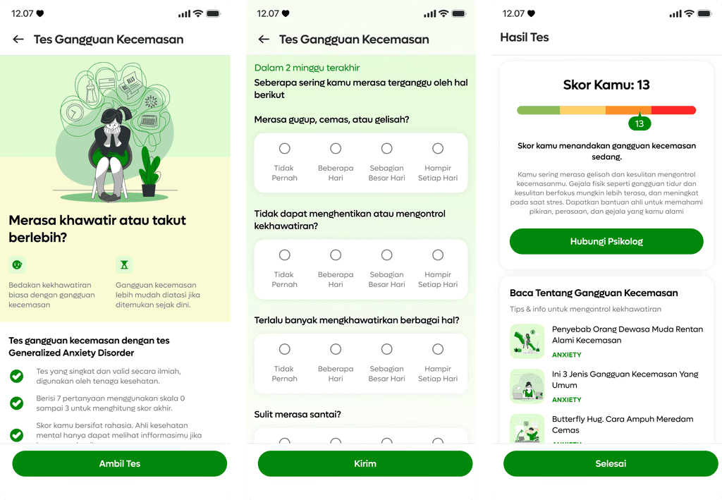
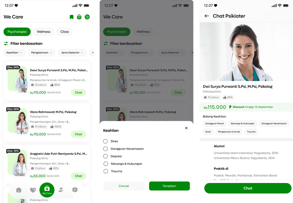
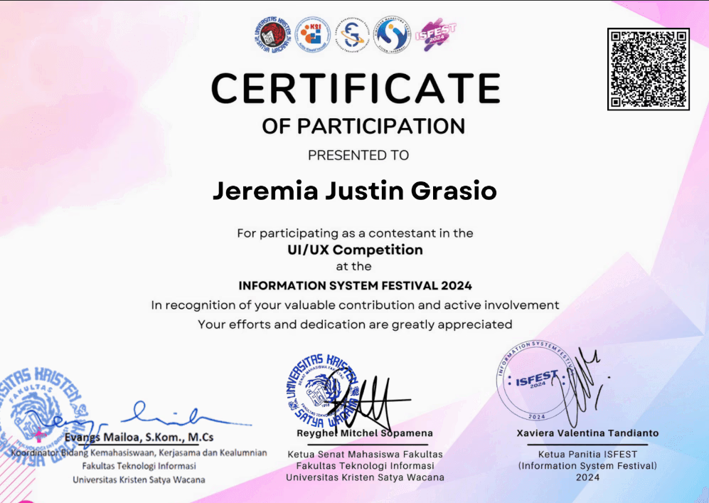
My ISFEST UI/UX competition project at Universitas Kristen Satya Wacana (UKSW): a mental health app concept designed in a 12-hour challenge.
PROJECT INFORMATION
Role:
UI/UX Designer
Organizer:
Universitas Kristen Satya Wacana (UKSW)
Category:
UI/UX Competition
Location:
Salatiga, Central Java, Indonesia
Team:
Shiva Augusta, Anggara Dwi
Tools:
Figma, Canva
ABOUT
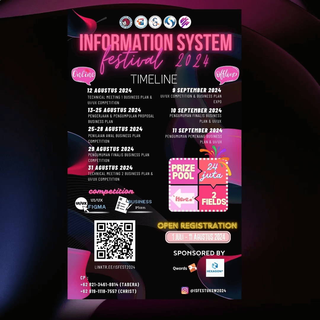
ISFEST
ISFEST (Information System Festival) is a national level competition that pushes participants to think fast, design creatively, and solve real problems under pressure. One of its most thrilling events is the 12 Hour Live UI/UX Design Competition, where designers race against the clock to craft impactful solutions from scratch.
CONTEXT

Rules
In this competition, participants are given a surprise theme and just 12 hours to create a complete solution from ideation to high fidelity design. It’s an intense yet exciting challenge that tests creativity, adaptability, teamwork, and time management all at once.
CHALLENGE

Design, prototype, & mockup in 12 hours
Time: We had to complete everything research, ideation, wireframe/high fidelity design, and prototype within only 12 hours.
Theme: The theme, mental health, was revealed at the start, adding a surprising twist to the challenge.
PROCESS
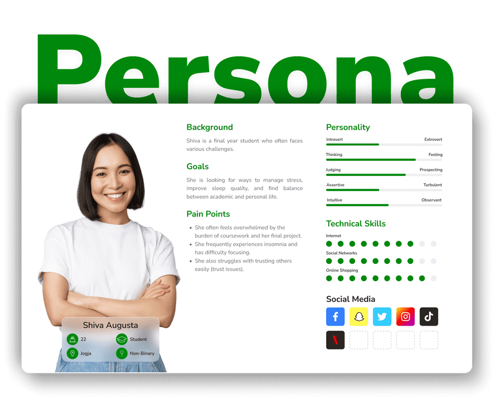
User Persona
We began by defining a user persona to understand our audience and guide design decisions. This step gave us clarity on user needs and pain points.
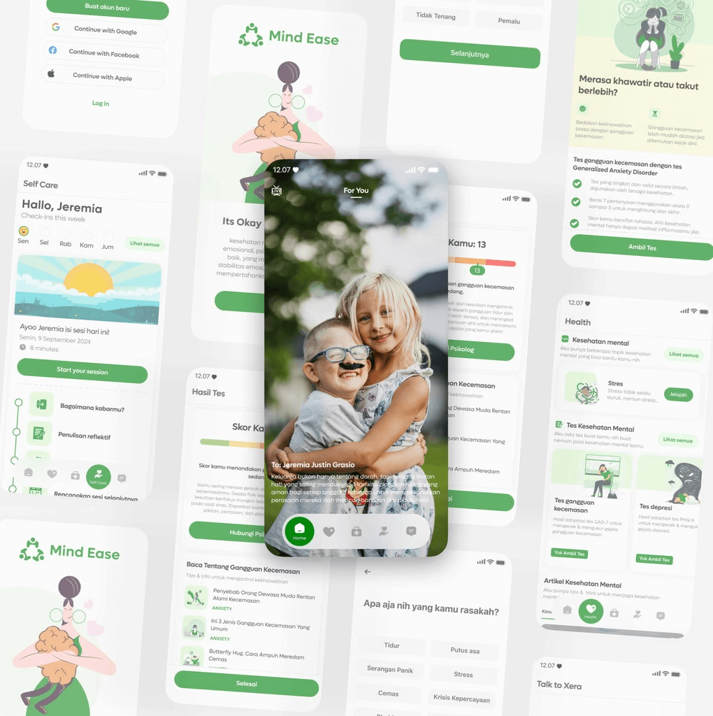
Jump to Hi fidelity design
For the visual direction, I chose calming green tones and a friendly, approachable design style to reflect peace and comfort. We also added a unique “belief” feature so if a user identifies as Christian, the app can show tailored Bible verses to provide emotional support.
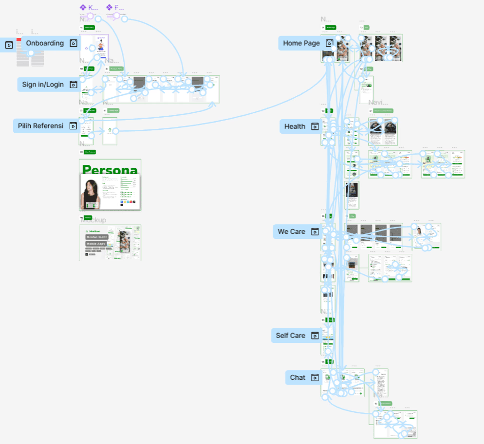
Prototype
With the design system and visual style in place, I created an interactive prototype to simulate real user experiences. This allowed us to test the user journey, refine the flow, and ensure the design was intuitive before finalizing it.
PREVIEW
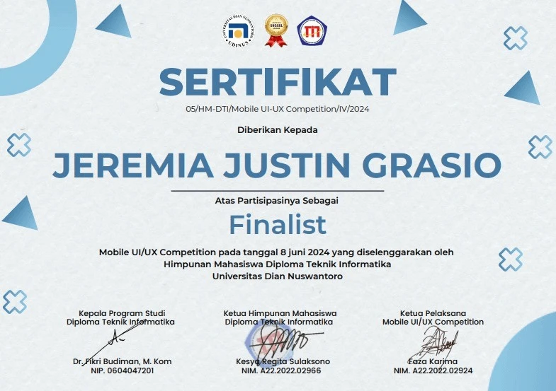
UDINUS National UI/UX Challenge — Pandai, Top 10
UDINUS UI/UX Challenge — Top 10
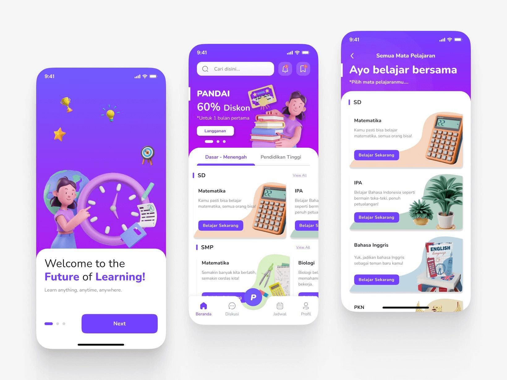
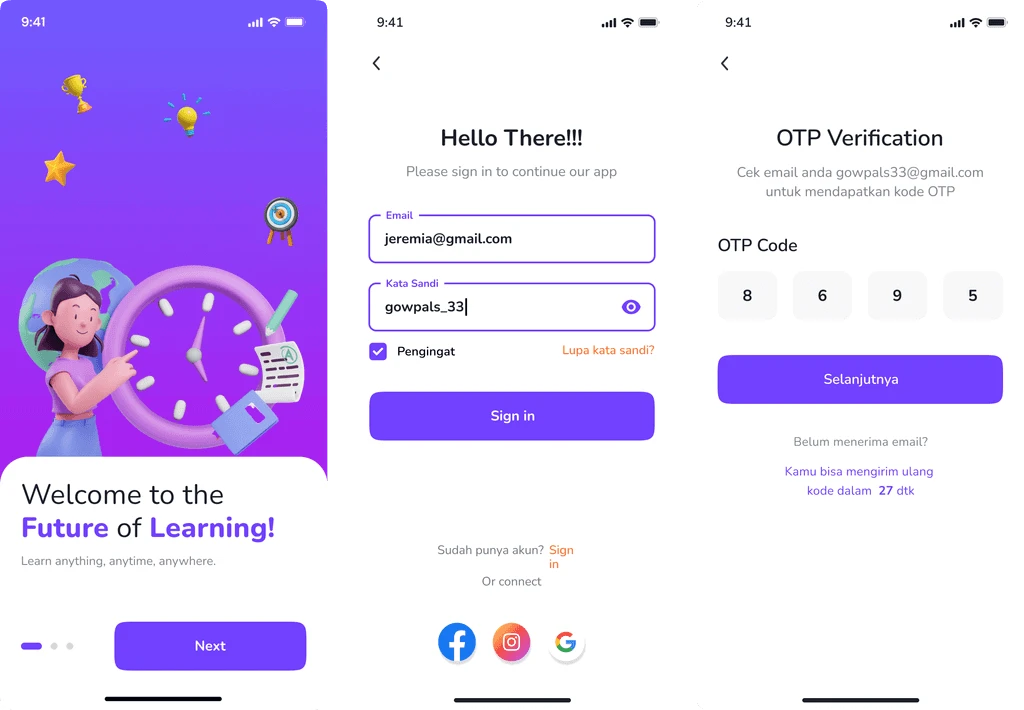
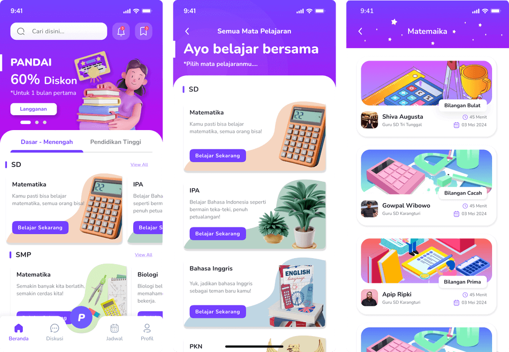
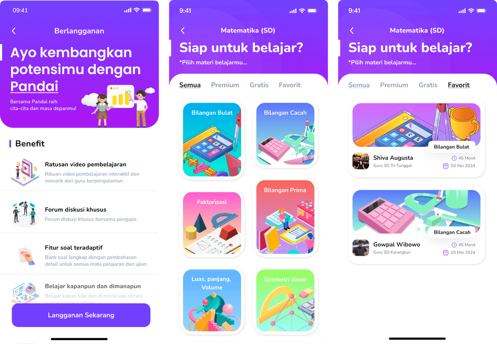
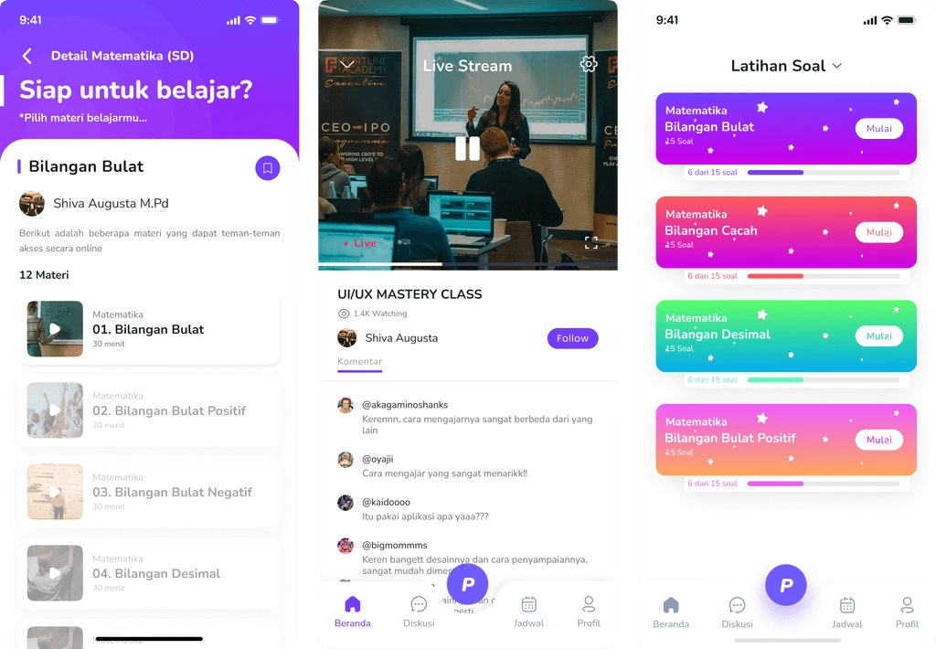
My Top 10 National UI/UX Challenge project at Universitas Dian Nuswantoro (UDINUS): Pandai, a personalized learning app concept with private learning, live classes, forums, and exercises.
PROJECT INFORMATION
Category:
UI/UX Competition
Role:
UI/UX Designer
Organizer:
Universitas Dian Nuswantoro (UDINUS)
Location:
Semarang, Central Java, Indonesia
Team:
Naufal Mussyafa
Tools:
Figma
ABOUT
Universitas Dian Nuswantoro (UDINUS)
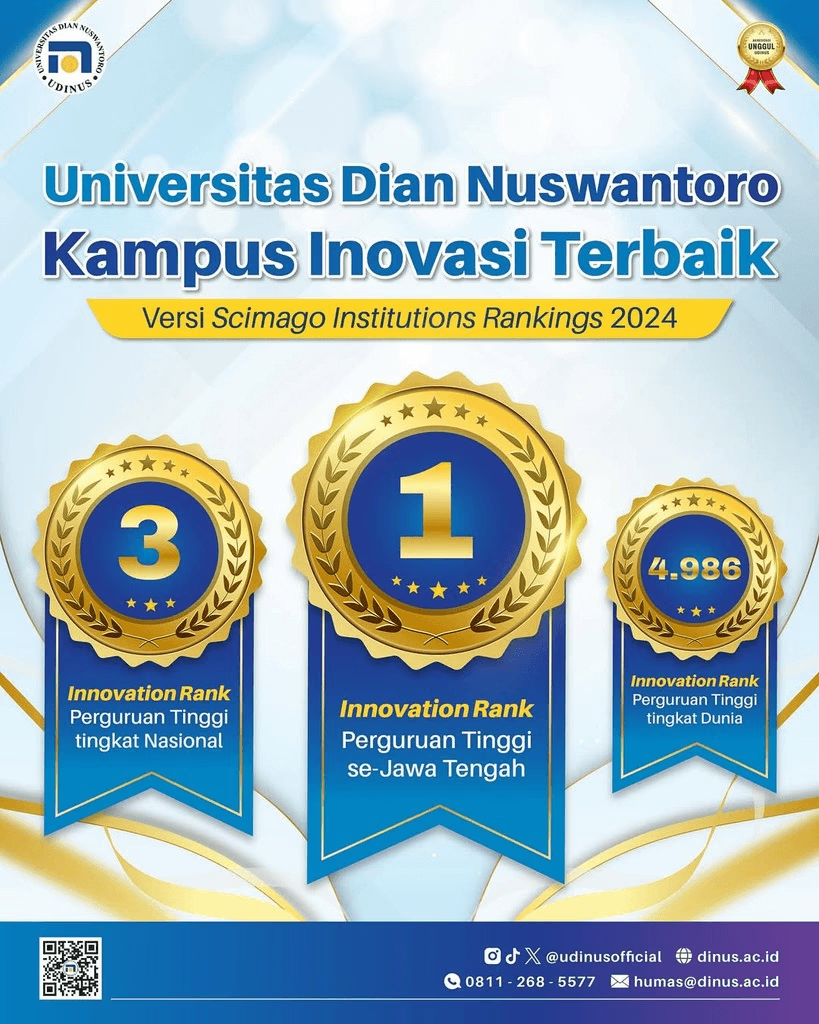
The National UX Challenge was organized by Dian Nuswantoro University, providing participants the opportunity to design innovative digital products.
CONTEXT

Personalization
Research revealed that most learning platforms focus on general video content and standard exercises but lack personalization and interactivity. This insight inspired the idea for Pandai, a platform offering tailored learning experiences for students from elementary to high school.
CHALLENGE

Effective and efficient
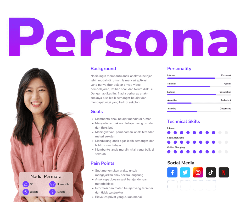
A housewife in Jakarta wants to support her children’s education with an online platform. She needs a simple yet effective app that offers structured lessons, live classes, and discussion forums while keeping her kids engaged and motivated to learn independently.
PROCESS
User Persona
We defined a parent persona seeking personalized online learning support for her children. Her needs for clear lesson choices, live classes, and practice exercises guided the Pandai education app design.
User Journey
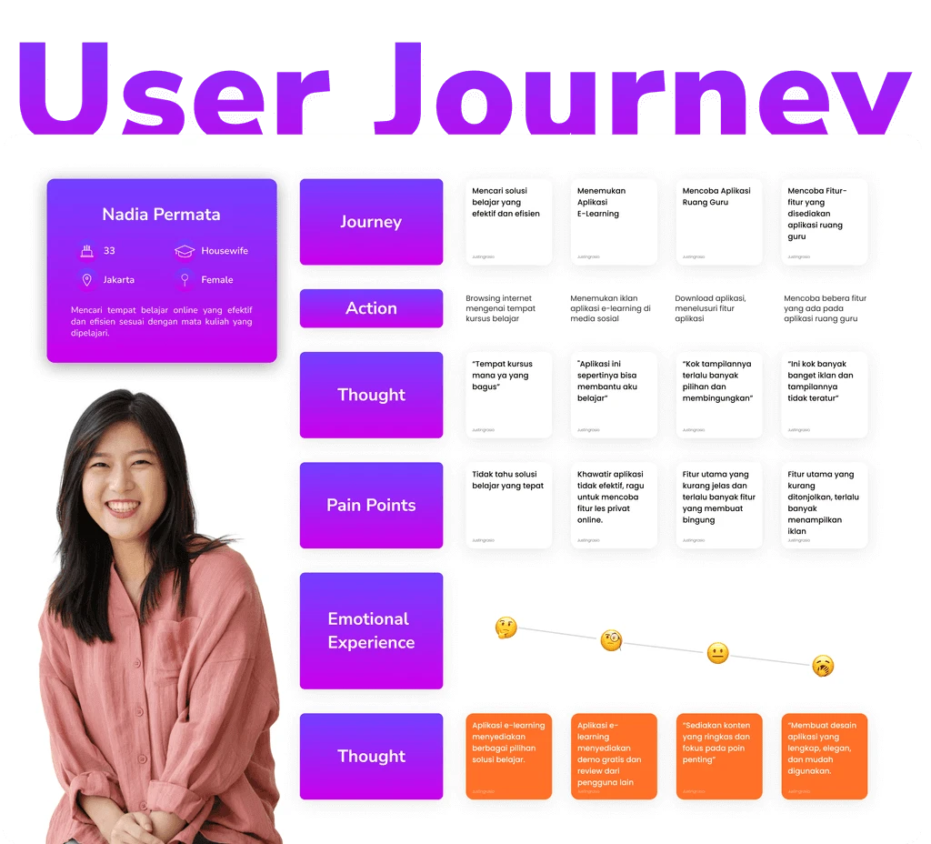
Her experience with most learning platforms is mixed: while she appreciates the wide range of features, she struggles with complicated navigation and disorganized content. This shows the need for a solution that is intuitive, structured, and tailored to users like her.
Wireframe
Wireframes were created to define the app’s structure and flow, focusing on usability and clarity. By testing early layouts, I ensured each feature supported user needs before moving on to detailed designs.
Hi-Fidelity Design
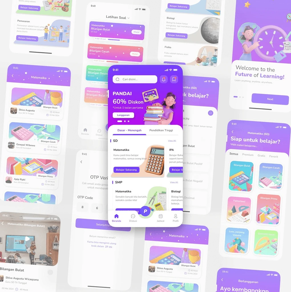
The final design introduced a clean, intuitive interface for accessing private learning sessions, educational videos, live classes, forums, and exercises. Accessibility and simplicity guided the overall design to ensure a seamless learning experience.
Prototype
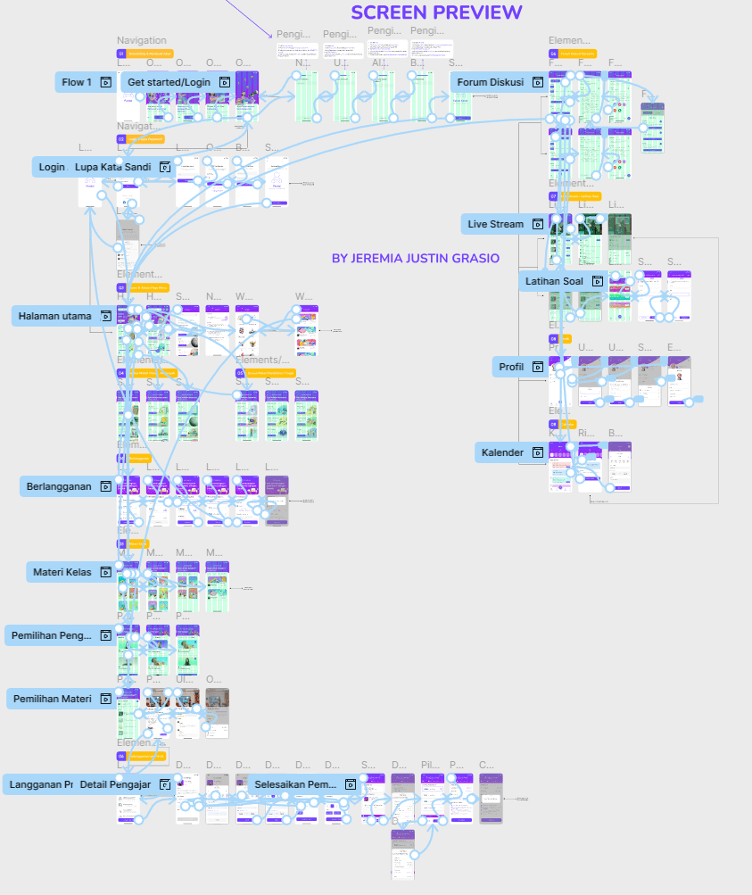
An interactive prototype demonstrated user flows from selecting private lessons to joining live classes and participating in discussions, making it easy to test and refine the design before development.
PREVIEW
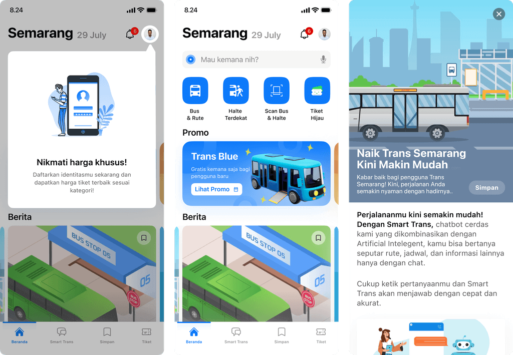
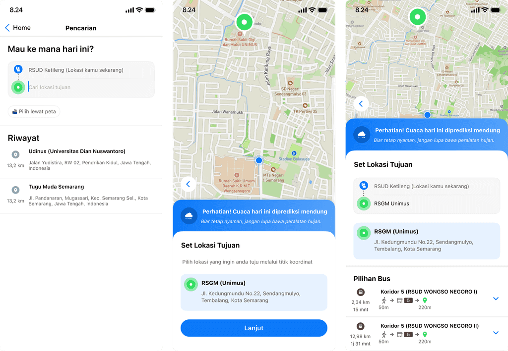
ANFORCOM UNDIP UI/UX — Bus Rapid Trans Semarang
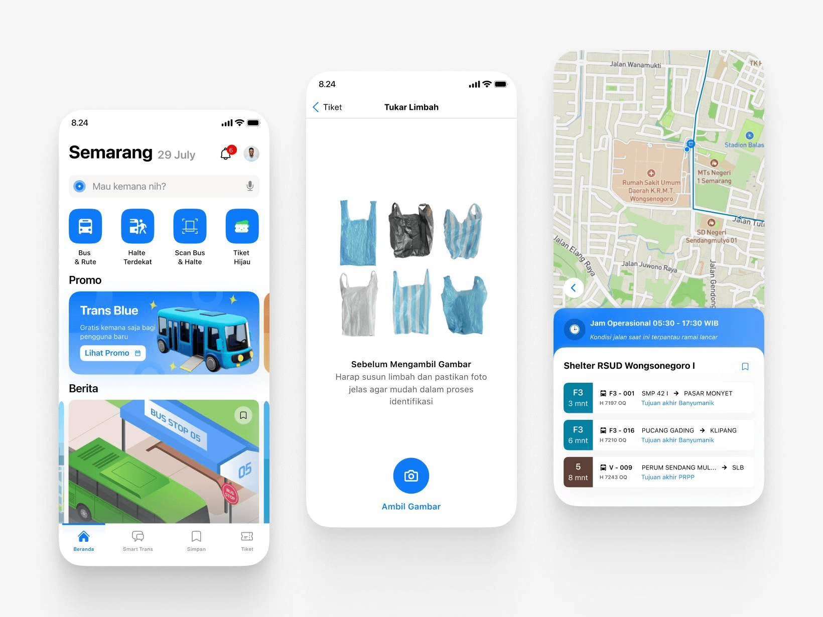
ANFORCOM UNDIP — Eco Tickets & Routes
My ANFORCOM UI/UX competition project at Universitas Diponegoro (UNDIP): a sustainable public transport app concept for Bus Rapid Trans Semarang.
PROJECT INFORMATION
Category:
UI/UX Competition
Role:
UI/UX Designer
Organizer:
Universitas Diponegoro (UNDIP)
Location:
Semarang, Central Java, Indonesia
Team:
Shiva Augusta, Anggara Dwi
Tools:
Figma, Canva
ABOUT
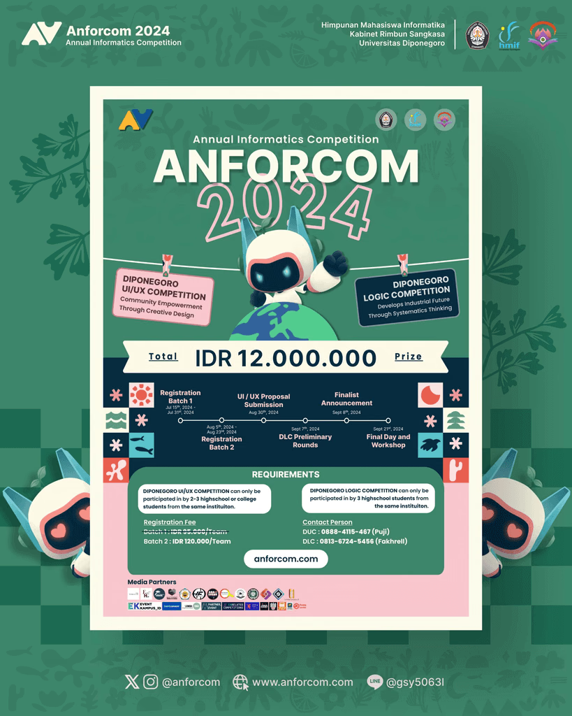
Anforcom
Anforcom is a national level competition organized by Diponegoro University. It brings together students from across Indonesia to compete in programming, UI/UX design, data analysis, and more. The event celebrates innovation, collaboration, and forward-thinking in the tech industry.
CONTEXT

Semarang currently lacks a proper public transportation application to support efficient commuting. With increasing urbanization and the growing need for eco friendly solutions, digital innovation in public transport has become essential to improve accessibility and sustainability for the city’s residents.
CHALLENGE

Design a city sustainability focused public transportation app with AI powered features to tackle Semarang’s pollution problems while making the Bus Rapid Transit (BRT) system more efficient, eco friendly, and user friendly.
PROCESS
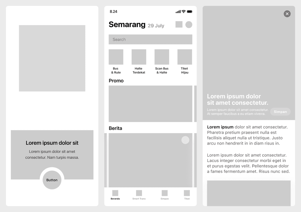
Wireframe
Built wireframes to design a smooth, intuitive user journey from the start.
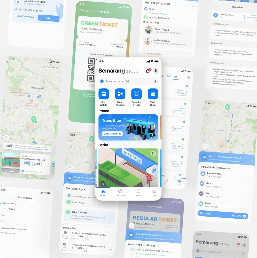
Hi-Fidelity Design:
Designed core features such as:
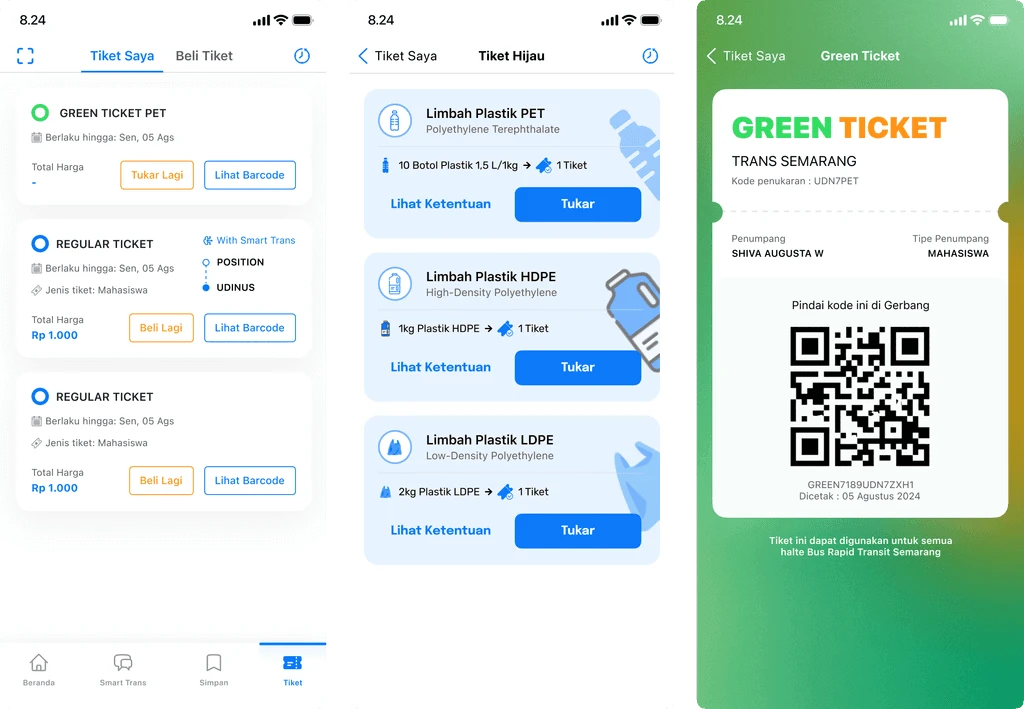
Green Ticket Program: Exchange plastic waste for bus tickets.
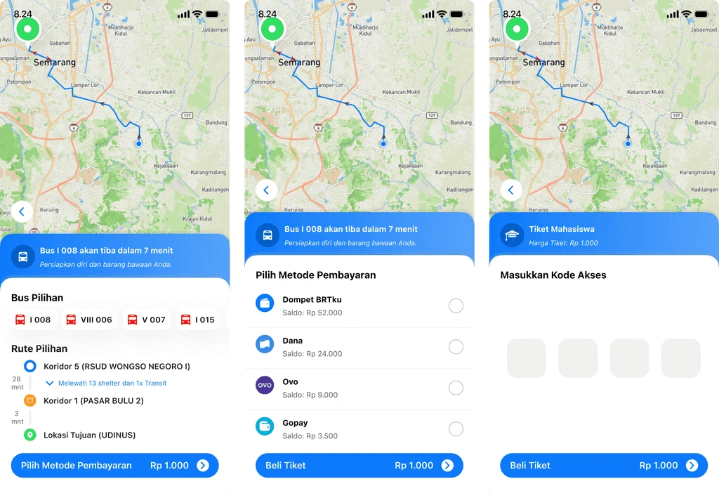
Real-Time Bus Tracking: View accurate bus locations and arrival times.
Personalized Journey Planning: AI-powered route suggestions for efficient travel.
Reward System: Redeemable vouchers to encourage engagement.
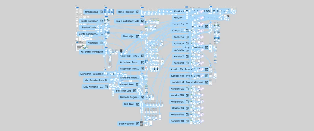
Prototype
Developed an interactive prototype to simulate user interactions and present the final concept clearly to the committee.
PREVIEW